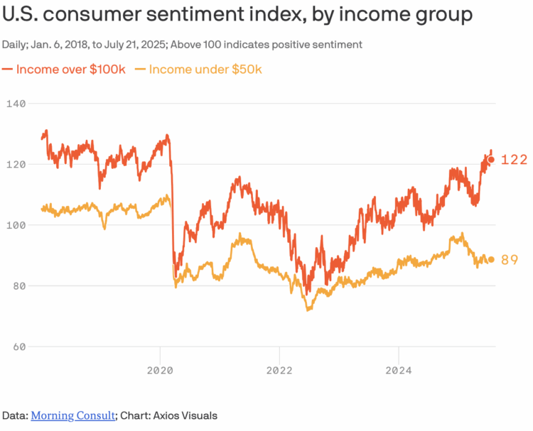
From Axios, a quick chart that shows consumer sentiment between those with annual income over $100,000 and those under $50,000. As you might expect, sentiment is higher (and positive) for those with more income, which is usually the case, but the difference between higher and lower income groups seems like it’s going to grow more.
Diverging consumer sentiment
FlowingData Delivered to Your Inbox
Chart Type Used
