Daily Routine, 2020
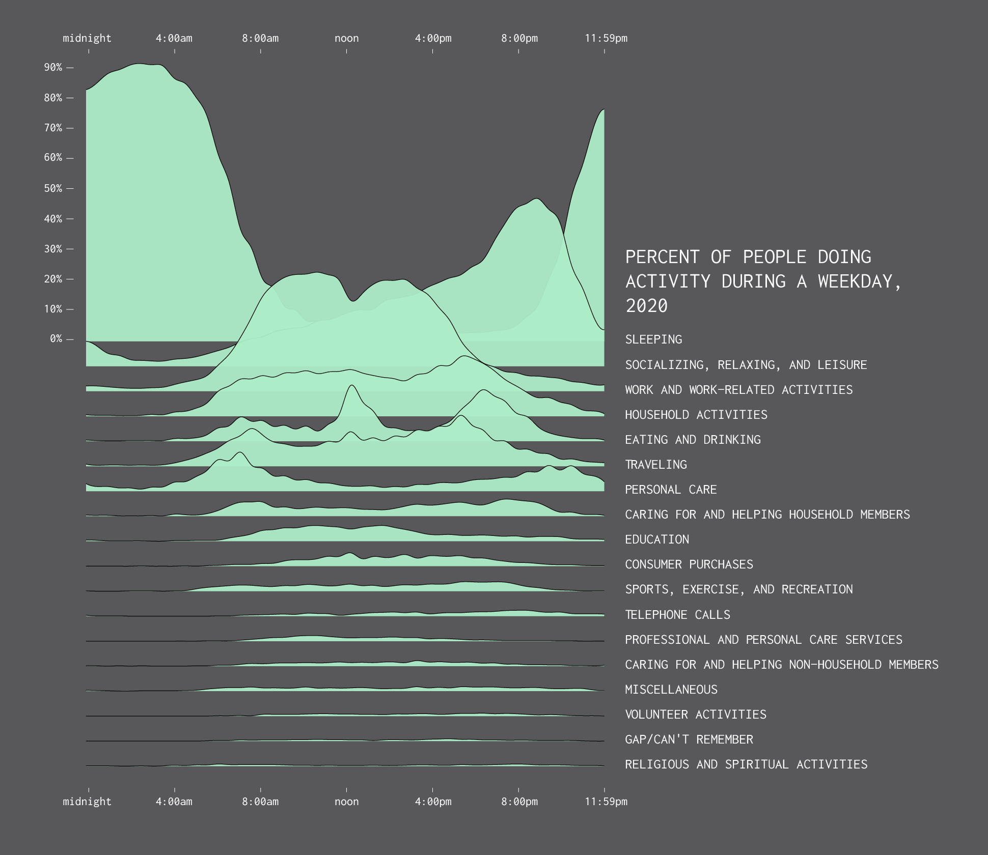
After looking at how much time we spent on daily activities in 2020, let’s look at when we spent our time. Based on data from the American Time Use Survey, the chart below shows the percentage of people doing activities on a non-holiday weekday.
This doesn’t look all that different from 2019 distributions, shown below. Sleep peaks during the late night hours; socializing and relaxing peaks during the evening hours; eating and drinking peak during lunch and dinner.
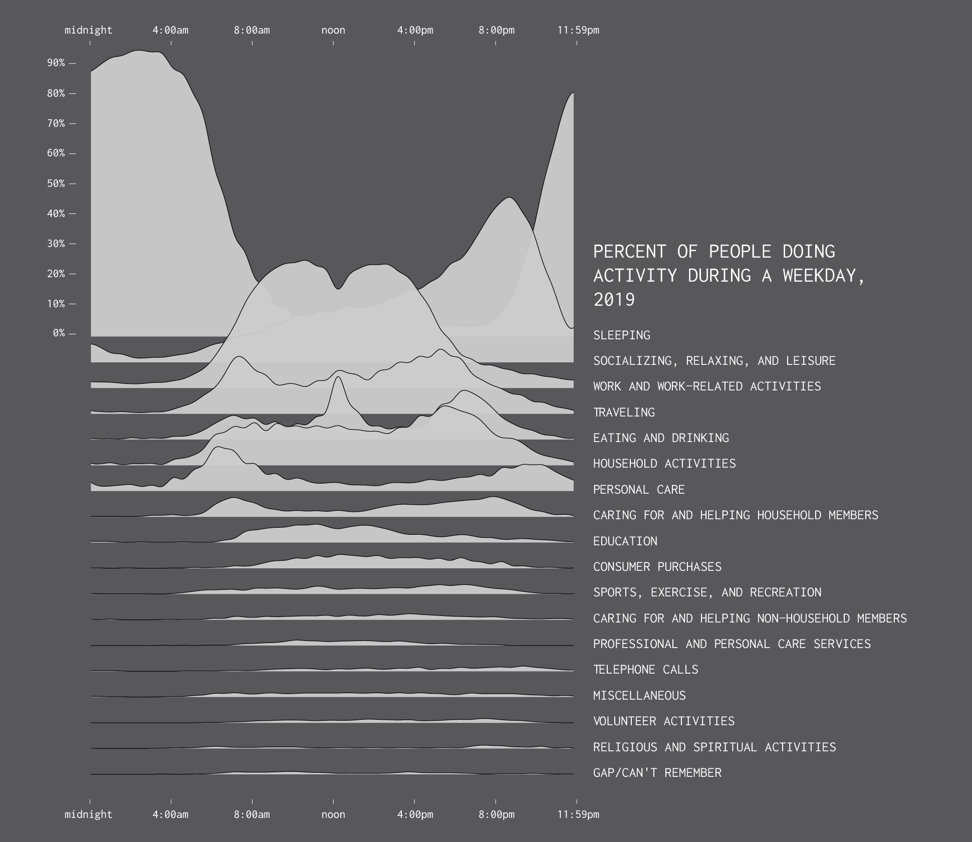
Although it’s kind of hard to compare between the two years with the separate views, so here’s 2020 overlaid on 2019 time use:
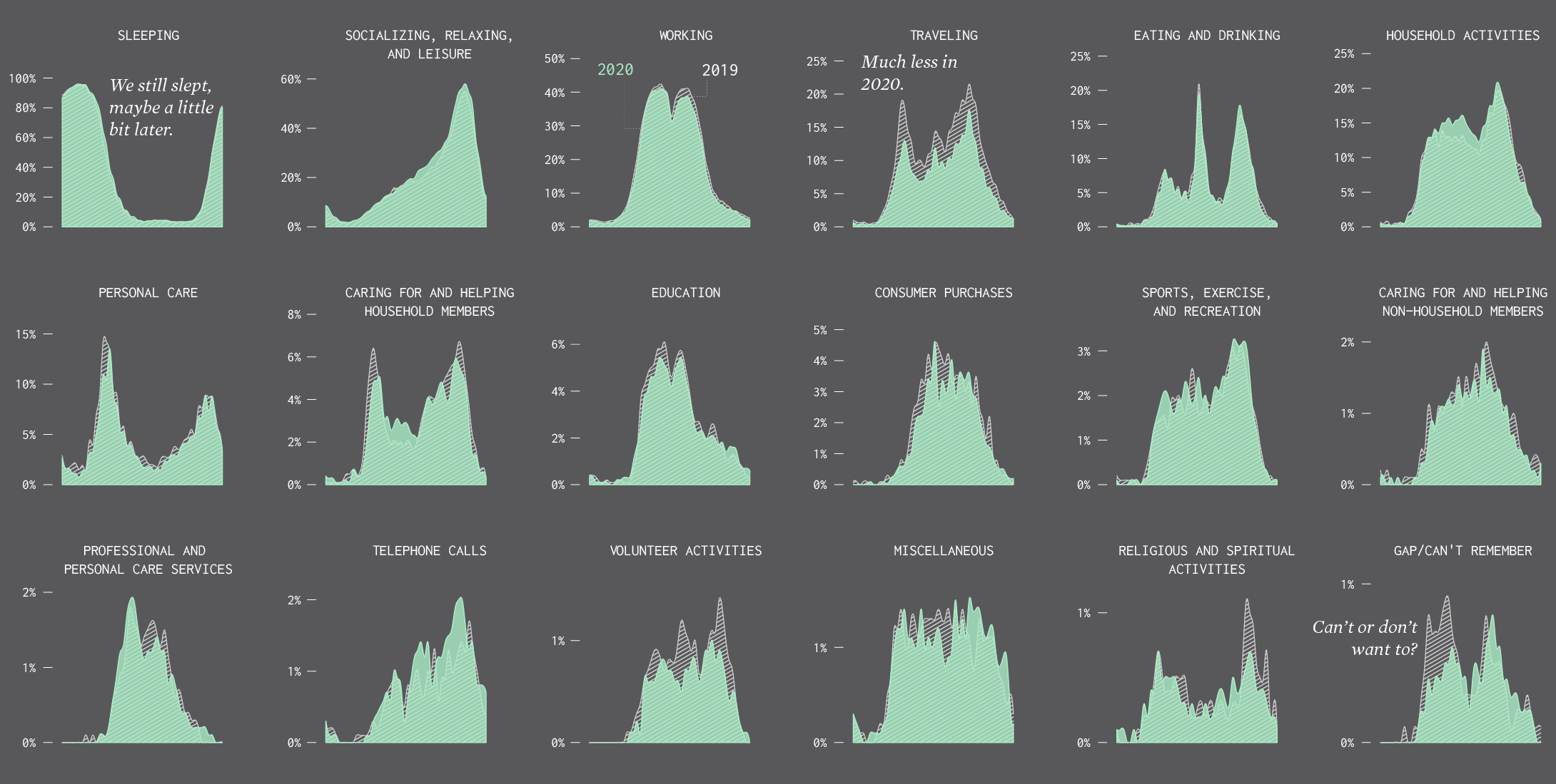
Some activities were down noticeably in 2020: traveling, volunteering, shopping, and religious activities. Caring for household and non-household members was also down, but I suspect a big chunk of that comes from decreased waiting and commuting related to those activities.
Household activities and telephone calls were up, which seems right.
Overall, the distributions over the day don’t look that different between 2020 and 2019. I thought there would be more variation between the two.
I have a feeling that this breakdown of activities is only part of the story though. Maybe where these activities were down, at home versus somewhere else, is a good next step. Maybe looking at secondary activities (these are primary) is also worthwhile to see how people had to do more at once (like take care of kids while working).
Notes
Become a member. Support an independent site. Make great charts.
See What You Get


