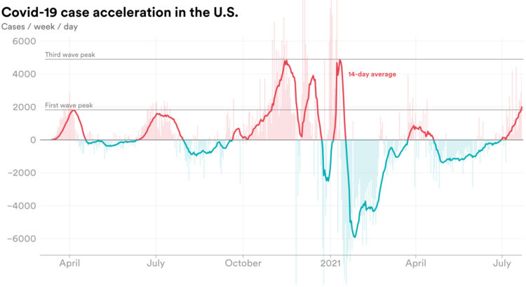
We’re all familiar with the Covid-19 line charts that show cases over time, which highlights absolute counts. There are peaks. There are some valleys. Emory Parker for STAT shifted the focus to how quickly the rate is changing, or acceleration, to emphasize which direction rates are headed.


