Who Makes More Money

Someone mentioned that $400,000+ per year was commonplace in American households. That seemed like an odd comment, so here’s a chart that shows what percentage of households make at least a certain amount.


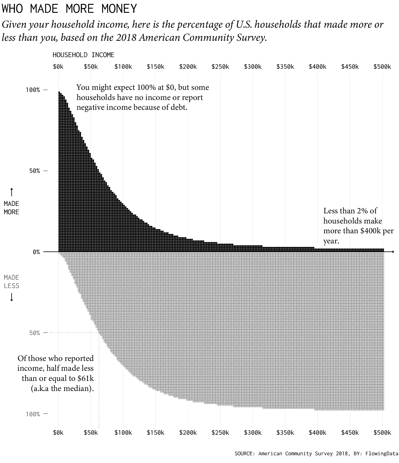
Less than two percent of households made at least $400,000 in 2018. So… not very common. I’m not sure what that person was thinking.

Become a member. Support an independent site. Make great charts.

See What You Get

Favorites

Shifts in How Couples Meet, Online Takes the Top

How do couples meet now and how has it changed over the years? Watch the rankings play out over six decades.

Who is Older and Younger than You

Here’s a chart to show you how long you have until you start to feel your age.

How People Like You Spend Their Time

Looking at American time use for various combinations of sex, age, and employment status, on weekdays and weekends.

Where Bars Outnumber Grocery Stores

A closer look at the age old question of where there are more bars than grocery stores, and vice versa.