Racial Divide
It’s hard to think of much else. These maps show the racial divide between black and white people in major cities. Select a city below.
Using updated data from the 5-year American Community Survey from 2018, this is a recreation of Jim Vallandingham’s project from 2011, which is based on Mike Bostock’s force-directed map. The greater the difference in black-to-white population between two neighboring areas, the greater the distance.
The cities were chosen based on FiveThirtyEight’s integration-segregation index.
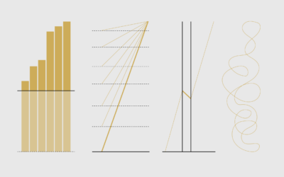
Chart Types Used


Become a member. Support an independent site. Get extra visualization goodness.
See What You Get