Best Burger Ranks
Burger rankings bubbled up in my feed, based on a survey conducted by Market Force. The methodology is kind of iffy, but let’s just pretend the rankings are rock solid. I mean, it’s all subjective anyways.
Survey participants were asked to grade fast food burger restaurants on eight criteria. The charts below show how each restaurant ranked.
Fast Food Burger Ranks
Survey participants were asked to rate places on eight criteria.

Speed of Service
Value for
Money Spent
Food Quality
Healthy
Options
Atmosphere
Worst
Best
Cleanliness
Curb Appeal
Staff
Friendliness

Speed of Service
Value for
Money Spent
Food Quality
Healthy
Options
Atmosphere
Worst
Best
Cleanliness
Curb Appeal
Staff
Friendliness
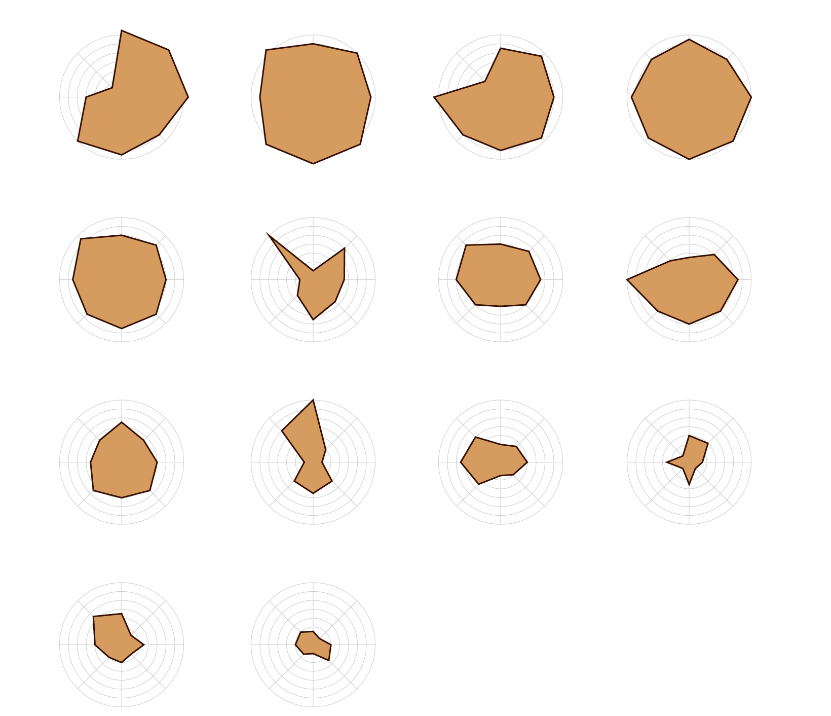
Five Guys
In−N−Out
Smashburger
Culver‘s
Speed
Value
Quality
Healthy
Atmos.
Overrated.
There can only be one king.
Never tried, but I’m intrigued.
Clean
Curb
Friendly
Whataburger
Steak ‘n Shake
Dairy Queen
Red Robin
Sonic
Jack in the Box
Wendy‘s
Carl‘s Jr.
Two tacos for a dollar. Nuff said.
Just add BBQ sauce and bacon.
Burger King
McDonald‘s
Haters. Have you even tried a Happy Meal?
Where the mascot will haunt your dreams…
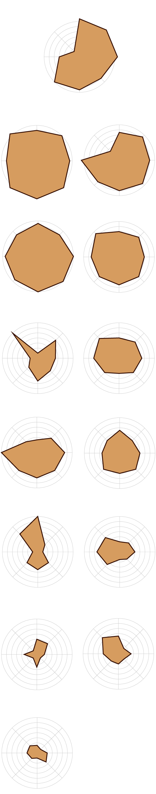
Five Guys
Speed
Value
Quality
Healthy
Atmos.
Overrated.
Clean
Curb
Friendly
Smashburger
In−N−Out
Never had, but I’m intrigued.
The true king.
Culver‘s
Whataburger
Steak ‘n Shake
Dairy Queen
Red Robin
Sonic
Jack in the Box
Wendy‘s
Two tacos for a dollar. Nuff said.
Burger King
Carl‘s Jr.
Just add BBQ sauce and bacon.
Where the mascot will haunt your dreams…
McDonald‘s
Haters. Have you even tried a Happy Meal?
The low rankings for the more national chains make me wonder what the actual survey questions and scoring criteria were.
For example, Carl’s Jr. ranks at the bottom for value, but last time I checked, you get a lot for your dollar there. Are the other places just that much better? Or what about Five Guys? It ranks so high in quality but so low for value.
In conclusion, the key takeaway is that In-N-Out is the best.
Notes
Chart Type Used

Become a member. Support an independent site. Get extra visualization goodness.
See What You Get