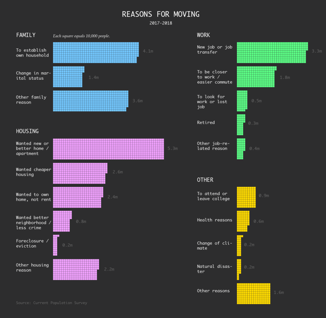
Why People Move
The Current Population Survey tracks mobility and migration in the United States. Since 1999, its asked for the reasons people moved from one place to the other. Here are the estimates for the most recent time segment between 2017 and 2018.
Notes
- You can download the historical data for the Current Population Survey here. I stumbled on the dataset via Tom MacWright.
- I made the chart in R. Relevant tutorial: Symbols-based Unit Charts to Show Counts in R.
Chart Type Used

Become a member. Support an independent site. Get extra visualization goodness.
See What You Get