If We All Left to “Go Back Where We Came From”

The phrase confuses me. I was born in California. My mom was born in New York. “Go back where you came from.” Um, okay. I mean, I was headed home anyways. My house is just a few blocks away.
I grew up in a mostly non-Asian city, so I used to hear the phrase sometimes. Kids like to pick on the one who looks a little different. But these days, when I hear an adult say it to another adult, it catches me off guard. It doesn’t make sense.
You traverse an American’s family tree, and eventually you find an immigrant. And most of the time, you don’t have to go back that far.
So … what if everyone went back where they came from?
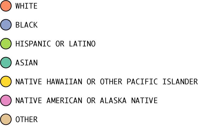
Based on data from the 2012-2016 American Community Survey, there were about 315 million people who lived in the 50 states or District of Columbia. Here are all of them. Each dot represents a person.
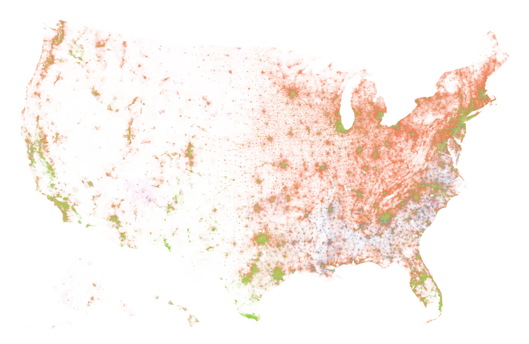
Imagine all 197.3 million non-Hispanic white people leave …
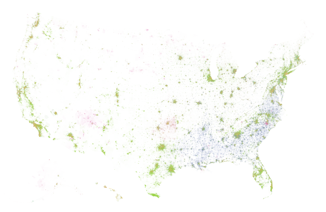
… and then 39.1 million black and 16 million Asian people leave …
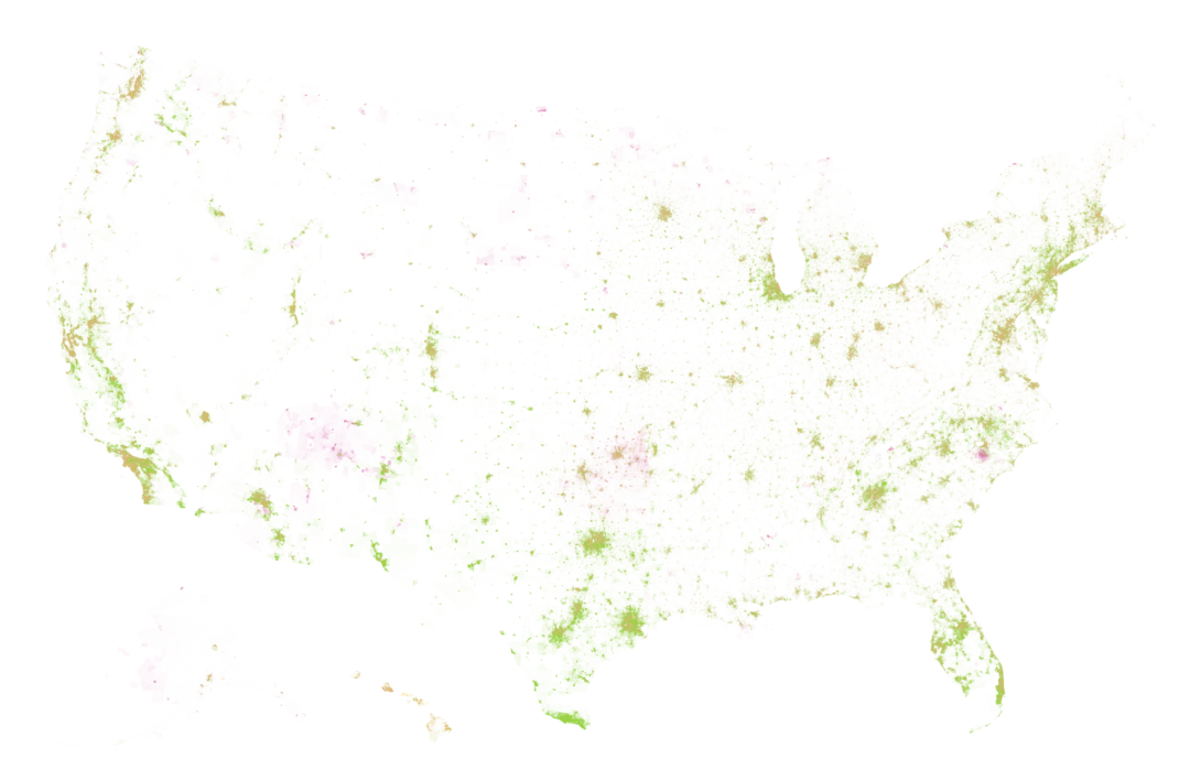
… and then 51.7 million Hispanic and Latino people …
… and the 7.9 million non-native people who are some other race or mixed …

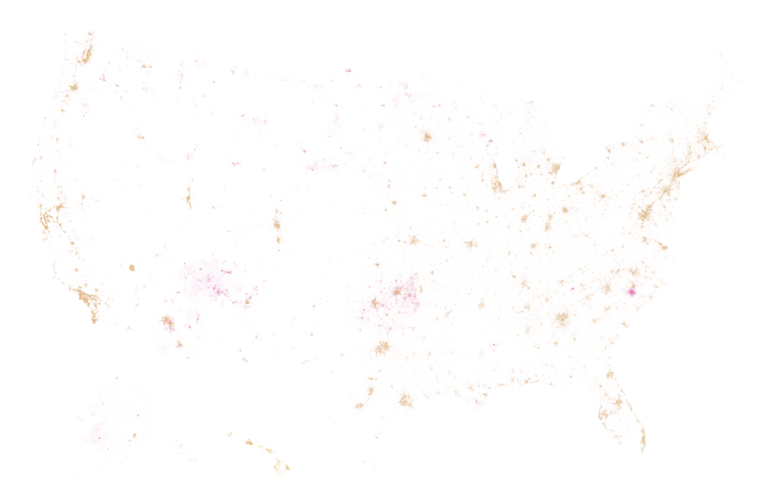
That leaves about 2.1 million Native American or Alaska Natives and 0.5 million Native Hawaiian or Other Pacific Islander. After that, it’s an empty shell of a country.
A simplified view, but you get the point. Everyone comes from somewhere.
Notes
- I used R to make the dot density maps, following similar steps to the dot density map tutorial.
- I’d been meaning to poke at this topic for a while, but the segregation maps by Aaron Williams and Armand Emamdjomeh got me curious again. See also Bill Rankin’s original map of Chicago and Eric Fischer’s follow-up.
- Dot density maps show limitations in densely populated areas. It’s not so much dots as it is a spackling of color.
Chart Type Used

Become a member. Support an independent site. Make great charts.
See What You Get