12 Days of ChaRt-mas
As everyone has already checked out for the rest of the year, I’m going to mess around with R to the tune of The Twelve Days of Christmas and maybe throw down a few tips. You’re welcome.
On the First Day
♪ A Bar Chart that Looks Like a Tree ♪
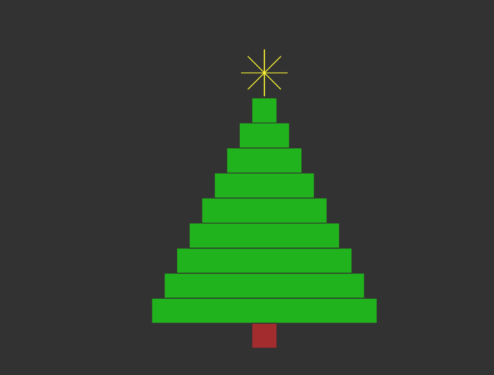
Get it? Instead of a partridge in a pear tree, I said a bar chart that looks like a tree.
Oh whatever. It’s hilarious. Here’s the R code you grinch:
par(bg="#333333")
xleft <- seq(5, 45, 5)
xright <- seq(95, 55, -5)
ybottom <- xleft
ytop <- ybottom + 5
plot(0, 0, xlim=c(0, 100), ylim=c(0,60), type="n", asp=2, axes=FALSE, xlab="", ylab="")
rect(xleft, ybottom, xright, ytop, col="#0fb500", border="#333333")
points(50, 55, pch=8, cex=5, col="yellow")
rect(45, 0, 55, 5, col="brown", border="#333333")
On the Second Day
♪ 2 Stupid Bugs ♪
- On more than one occasion I’ve edited a file that defines a function and then gone back to a script that runs said function, only to discover nothing changed. I go crazy for a little while trying to figure out wtf. Then I remember I have to
source()again. Oh. - I often shift between R and JavaScript. I often accidentally write JavaScript in R and R in JavaScript, only realizing it when I get an error. I’m smooth.
On the Third Day
♪ 3 Charts Originally Drawn with a Pen ♪
Statistician John Tukey is a legend. Look him up if you haven’t heard of him. In his 1977 book Exploratory Data Analysis, he describes how to use pens and pencils to draw visual variation. The charts in the book are also hand-drawn. John, these charts are for you.
First, here’s some random data:
x <- rnorm(100, mean=10, sd=10)
y <- rnorm(100, mean=10, sd=10)
The stem-and-leaf, my friends:
  The decimal point is 1 digit(s) to the right of the |

  -1 | 2211
  -0 | 9987766
  -0 | 43333321100
   0 | 0112223444
   0 | 5566677778888889
   1 | 00011122223334444444
   1 | 5666677788999
   2 | 00001111223
   2 | 6666778
   3 | 2
stem(x)
The box and whisker diagram:
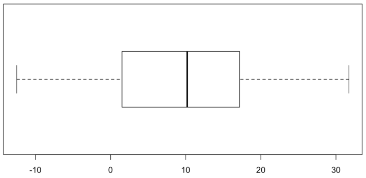
boxplot(x, horizontal = TRUE)
The dot plot with x’s because they’re easier to draw by hand than a bunch of circles:
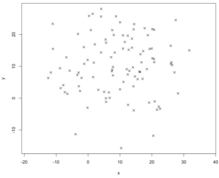
plot(x, y, pch=4, asp=1)
On the Fourth Day
♪ 4 Places to Add More Words ♪
Charts need context, and words are a good way to add context.
- Label your axes.
- Use a descriptive title.
- Annotate or highlight important data points.
- Say where you got the data.
Related: Annotating Charts in R.
On the Fifth Day
♪ 5 Golden Rings ♪

par(bg="#333333")
plot(0, 0, xlim=c(0, 120), ylim=c(0,10), type="n", asp=1, axes=FALSE, xlab="", ylab="")
x <- seq(20, 100, 20)
y <- rep(5.5, length(x))
symbols(x, y, circles = rep(8, length(x)), inches=FALSE, add=TRUE, fg="gold", lwd=5)
It’s days like these I’m glad that R includes a bunch of colors() written out instead of in hexadecimal. But how do I choose between gold, gold1, gold2, gold3, and gold4? Decisions, decisions.
On the Sixth Day
♪ 6 Minutes of Praying this Script Finishes ♪
I am the king of slow R scripts. Sometimes I like to play a game called “Let’s see if I can write and run a Python script that does what this slow R script is supposed to do before the R script finishes.”
On the Seventh Day
♪ 7 Squares a-Switching ♪

Thanks, animation package for letting me stay out of the terminal.
library(animation)
nframes <- 14

saveGIF({
    for (i in 1:nframes) {
        par(bg="#333333")
        plot(0, 0, xlim=c(0, 160), ylim=c(0,10), type="n", asp=1, axes=FALSE, xlab="", ylab="")
        x <- seq(20, 140, 20)
        y <- rep(5.5, length(x))

        col <- rep("#000000", length(x))
        if (i <= 7) {
            col[i] <- "#ffffff"
        } else {
            col[15-i] <- "#ffffff"
        }
        symbols(x, y, squares = rep(16, length(x)), inches=FALSE, add=TRUE, bg=col, fg="#ffffff", lwd=1)
    }
}, movie.name = "a-swimming.gif", interval=0.1, ani.width=720, ani.height=350)
On the Eighth Day
♪ 8 Reasons for Kicking…Myself ♪
- There are a lot of R packages that help you visualize data in many different ways. So I usually search before I implement. Sometimes I forget and waste way too much time. Always search for previous work.
- Why isn’t this working? Why isn’t this working? Why isn’t this working? Oh. I should’ve read the documentation more carefully the first time around.
- When I didn’t set
stringsAsFactorsto FALSE. - When I thought I could work after eating that big burrito and chips for lunch.
- When I prioritized quantity over quality. Kind of like with this list. Good thing no one is reading this.
- Forgetting to include a description of chart encodings, because somehow everyone will magically be able to read a non-standard chart.
- When I spend too much time thinking about the “right” way to do something when I should really just start the project.
- Saying yes to that talk four months out, because that’s plenty of time to prepare.
On the Ninth Day
♪ 9 Dots Dancing ♪
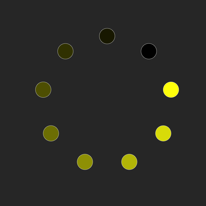
library(animation)
nframes <- 20
theta <- 2 * pi / (9)
pal <- colorRampPalette(c("#000000", "yellow"))
col <- pal(9)

saveGIF({

    for (i in 1:nframes) {
        par(bg="#333333")
        plot(0, 0, xlim=c(0, 120), ylim=c(0,120), type="n", asp=1, axes=FALSE, xlab="", ylab="")
        x <- 50 * cos((1:9+i/nframes*5) * theta) + 60
        y <- 50 * sin((1:9+i/nframes*5) * theta) + 60

        symbols(x, y, circles = rep(6, length(x)), inches=FALSE, add=TRUE, bg=col, fg="#ffffff", lwd=1)
    }

}, movie.name = "dots-swimming.gif", interval=0.1, ani.width=720, ani.height=720)
On the Tenth Day
♪ 10 Places of a-Learning ♪
There are resources aplenty for learning R these days.
- The Art of R Programming (book)
- R Cookbook (book)
- R Graphics (book)
- R Twotorials (short videos)
- R for Beginners (pdf)
- #rstats on Twitter
- End any chart type web search with “in R”.
- R documentation. Learn to read it, and you will become master.
- Lots of R resources.
- FlowingData Membership. Duh.
On the Eleventh Day
♪ 11 Things a-Wishing ♪
- “Why would you do it like that?” is not a good way to answer a question on StackOverflow. I wish people would remember that everyone is a beginner at some point.
- I wish R docs for chart- and map-related things could include pictures.
- I wish everyone understood histograms.
- I wish visualization “thought leaders” would make more and talk less.
- I wish everyone could see all the colors.
- I wish I could properly pronounce “statistician” every time I said it.
- I wish I could understand data better by drinking more beer. Then I could say “for science” as I held up my pint glass.
- I wish I could type faster.
- I wish I could read faster.
- I wish I could live slower.
- I wish R was named something less ambiguous like “SuperDuperData” so that I could more easily find what I’m looking for.
On the Twelfth Day
♪ 12 Drummers Drumming ♪

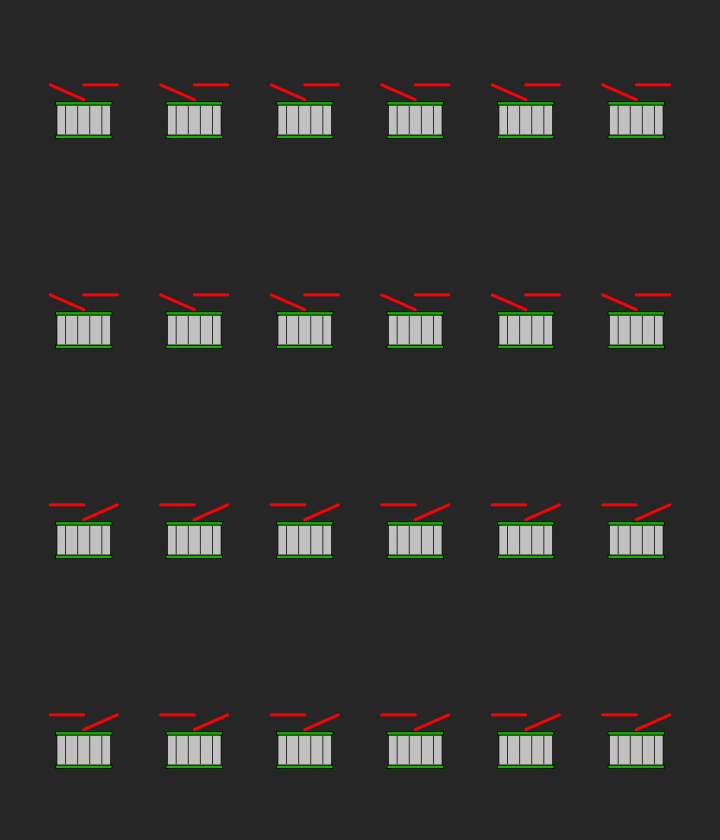
First the function to draw the drum:
drawDrum <- function() {
    rect(10, 5, 90, 50, col="#cccccc")
    rect(8, 0, 92, 5, col="#0fb500")
    rect(8, 50, 92, 55, col="#0fb500")
    x1 <- seq(23, 80, by=18)
    y1 <- rep(7, length(x1))
    x2 <- x1
    y2 <- rep(48, length(x1))
    segments(x1, y1, x2, y2)
}
Then animate that drumstick action:
saveGIF({
    par(mfrow=c(2,6), bg="#333333", mar=c(2,2,2,2), oma=c(0,3,0,3))
    for (i in 1:12) {
        plot(0, 0, xlim=c(0, 100), ylim=c(0,100), type="n", asp=1, axes=FALSE, xlab="", ylab="")
        drawDrum()
        lines(c(0, 50), c(80, 58), lwd=4, col="red")
        lines(c(50, 100), c(80, 80), lwd=4, col="red")
    }

    par(mfrow=c(2,6), bg="#333333", mar=c(2,2,2,2), oma=c(0,3,0,3))
    for (i in 1:12) {
        plot(0, 0, xlim=c(0, 100), ylim=c(0,100), type="n", asp=1, axes=FALSE, xlab="", ylab="")
        drawDrum()
        lines(c(0, 50), c(80, 80), lwd=4, col="red")
        lines(c(50, 100), c(58, 80), lwd=4, col="red")
    }
}, movie.name = "drumming.gif", interval=0.3, ani.width=720, ani.height=420)
Sorry, Pixar, I’m not available for your next film.
Happy holidays! I hope the rest of your year is filled with family, friends, and good food.
Become a member. Support an independent site. Get extra visualization goodness.
See What You Get
