Fatal Traffic, When and Where
There were 31,917 recorded fatal car crashes in the United States in 2015. These led to 35,092 deaths. According to the National Highway Traffic Safety Administration, this means “7.2% more people died in traffic-related accidents in 2015 than in 2014. This unfortunate data point breaks a recent historical trend of fewer deaths occurring per year.”
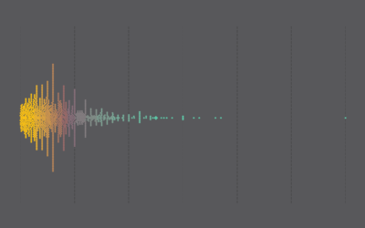
I looked at 2010 data several years ago. It seems like a good time to revisit. I aggregated by day in my original graphic, but I think John Nelson used a better format (also several years ago) to look at crashes by month and time of day.
So I borrowed John’s format to apply to the most recent data, breaking it up by area (rural or urban) and factors involved (alcohol, pedestrians, or weather).
Crashes were just about evenly split between rural and urban areas. However, as you’d expect, pedestrians are involved in a much lower percentage of crashes in the former. Fewer people walking around means fewer crashes with walkers.
Alcohol appears to play a bigger role in rural areas though with higher percentages starting earlier in the evening.
Anyways, I’m just starting to poke at the data. There seems to be a lot of angles to look at (along with a lot of gaps in the dataset). I’ll let you know if I find anything interesting.
Notes
- I suspected to see a high percentage of distracted driving to include in the factors list, but most crashes do not include distraction information.
- Each crash has latitude and longitude attached. At the national scale, the data looks like population density. Although note the emergence of highways and roads:
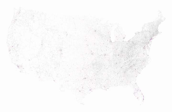
I suspect a need to look locally to find more interesting things. - There is a field in the dataset that marks crashes as occurring in urban or rural areas. However, a couple thousand crashes are not classified. So instead, I used the urban area shapefile for 2015 from the Census Bureau to re-classify the crashes.
Chart Type Used

Become a member. Support an independent site. Get extra visualization goodness.
See What You Get