How We Spend Our Money, a Breakdown
In college, I was a library assistant for ten hours a week at $7 per hour. This was my spending money, and I stretched my dollars pretty far. These days, my wife and I work full-time, there’s more than $70 a week for the household, and the spending breakdown is different. There’s a mortgage to pay and a kid to support. There’s a retirement to plan for.
Spending changes a lot depending on your situation. (Yeah.) It’s a good indicator for what people care about and what they need. It’s also a good indicator of where the economy is at.
The Bureau of Labor Statistics (using data collected by the Census Bureau) estimates spending patterns over time and across demographics, through the Consumer Expenditure Survey.
BLS released midyear estimates today. Spending on food, housing, and healthcare is up from the same time period last year. Spending on clothes, personal insurance, and everything else is down.
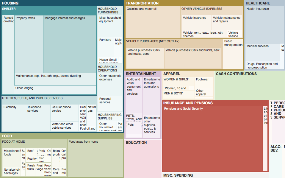
Annual averages won’t come out until later so let’s look at the most recent annual estimates for 2013 and look back through 1984 — for income groups and household composition.
The most obvious change comes when you switch between the lowest 20 percent in income and the highest 20 percent, regardless of year. In 2013, the personal insurance and pensions category goes from 2 percent to 16 percent. Spending on rent shifts to mortgage.
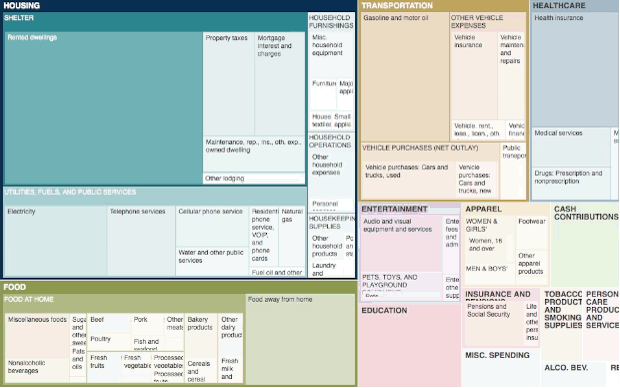
Not surprising, you see a similar shift between single-person households and married couples with children.
As you move through the years, you see less spent on apparel and more on healthcare. Are clothes getting cheaper or are people spending less? Opposite question for healthcare. I don’t know the answer, but there that is.
In 2013, about 2 percent of expenditures go to cell phone service, but in 2010, it’s not even an available data point. Spending data on pets and toys disappears during the same switch. Update: The data for cell phone service and pets and toys for earlier years is available only by request and not published in the BLS public database. So the disappearance here is more of an indictor of public interest.
Here’s how spending has changed over the years for the main expenditure categories, split up by increase, decrease, and about the same.
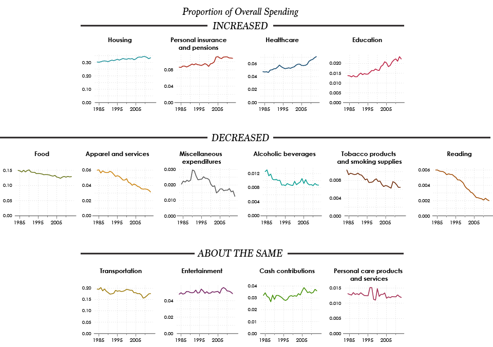
What do you notice?
Chart Types Used


Become a member. Support an independent site. Get extra visualization goodness.
See What You Get