How Histograms Work

The histogram is one of my favorite basic chart types, because it lets you quickly see the shape and distribution of a dataset. However, a lot of people don’t know what a histogram shows or how the chart works.
This is a guide for that. Because seeing distributions is way more interesting than means and medians, which oftentimes overgeneralize.
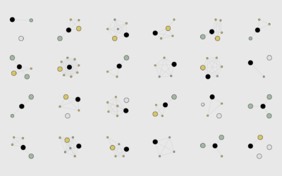
Start with some random data. We don’t care what the data is about right now. All you need to know is that darker dots represent higher values, and lighter dots represent lower values. The positions of the dots are random and don’t mean anything.
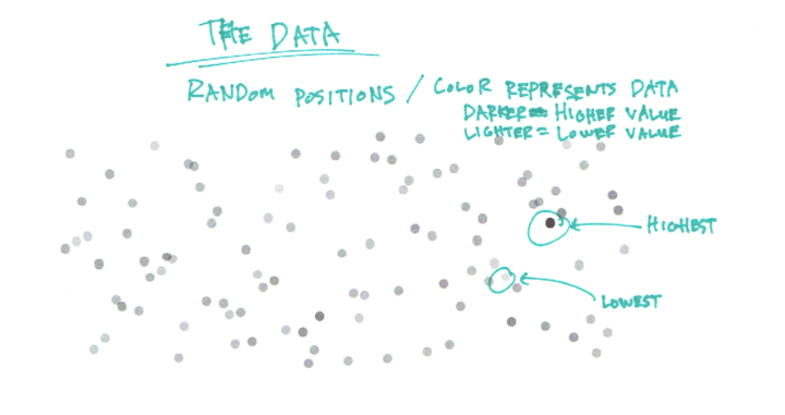
Given the random positions, it’s tough to make out any patterns in the data. Are there more data points on the low end or on the high end? What about values in the middle?
A straightforward thing to do: Line up all the dots in increasing order from left to right. You get something that looks like a gradient and takes up a lot of horizontal space.
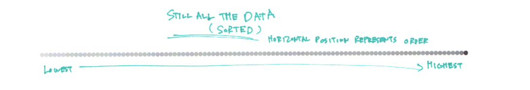
It’s still not obvious how frequently different values appear. You could count, but that defeats the purpose of visualizing the data. Just make a table if you’re going to count.
How about if you put dots with the same (rounded) values in a stack and still sort horizontally? You get several stacks (or columns) of dots placed horizontally based on their values. Now you can easily see higher and lower stacks and where they sit on the value axis (the x-axis). Most of the data falls into the middle with fewer as you move out to the edges.
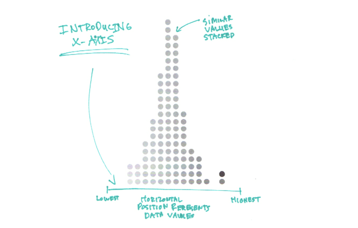
You can make out the shape of the data and see individual data points. But what if you have a million data points instead of a hundred. There are only so many pixels on the screen or so much space on paper to show the individual dots. So instead, you can abstract the dot columns into bars. Bar heights match the heights of the dot columns.
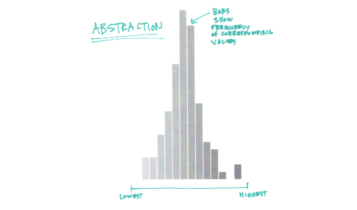
The bars make the shape of the data straightforward. Again, you see higher frequencies in the middle of the value spectrum and then the bar heights taper off as you move away from the middle.
When you see just means and medians, you only see a sliver of the middle and miss out on all the details of the full dataset. Maybe the spread is wider. Maybe it’s really narrow. Maybe the shape favors the left side or the right side.
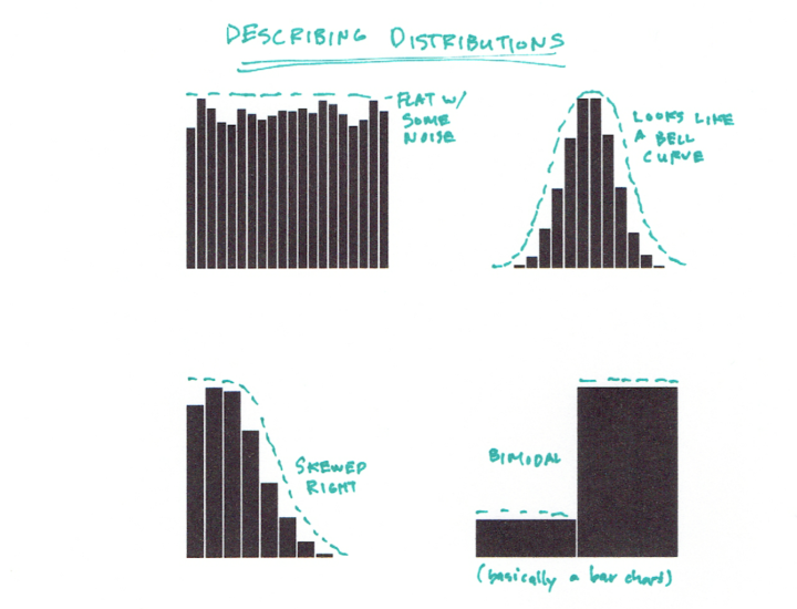
In this example, the shape is mostly centered, and if you’ve taken a statistics course, you might recognize it as a normal distribution. All the recurring shapes tend to have a name like Poisson distribution, uniform, binomial, etc. If you know all the distributions, then that’s great, but you don’t have to know the names to get use out of them. Here are a handful of common distributions:
In any case, the challenge I think in understanding histograms and communicating with them is the jump from stacked dots to the abstracted rectangles. Keep this step in mind when analyzing or presenting and the distributions will hopefully get the attention they deserve. Not everyone understands histograms, but we’ll get there eventually.
 How to Read and Use Histograms in R
Here’s some software-specific advice on histograms.
 How to Visualize and Compare Distributions
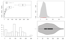
If the histogram isn’t doing it for you, there are other ways to see distributions.
Chart Type Used

Become a member. Support an independent site. Make great charts.
See What You Get