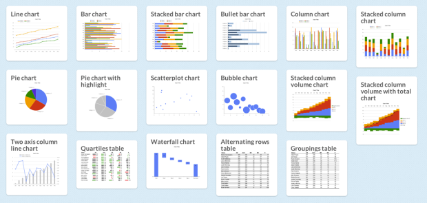
There are a lot of charts to choose from, and if you pick the wrong one you’ll end up communicating the wrong message or make it hard for others to read your data. Luckily, Juice Analytics has you covered with an interactive Chart Chooser, based on Andrew Abela’s flowchart from a few years ago.
There are toggle buttons on the top that let you filter based on what you’re looking for, such as a trend or relationship. For example, if you select comparison, distribution, and composition, you’re left with a bar chart. Don’t care about distribution? You can also try a stacked bar chart.
There is a second set of buttons that let you choose between Powerpoint or Excel. Once you find the appropriate chart type, you can download the template for the software you selected. Of course, if you’re not an Office user, you can always just use it for the choice making.
 Visualize This: The FlowingData Guide to Design, Visualization, and Statistics (2nd Edition)
This chart chooser is clearly flawed. I don’t see where we get to choose 3d charts.
How do I know if I should I explode my pie slices?!?!?
Follow your heart.
Interesting. found another see http://sileducation.files.wordpress.com/2009/12/yjwta.jpg
My current 5 graphs and charts, aimed to give synthesis / feedback loop between (my) art and therapy:
http://drosier.wordpress.com/2012/08/30/current-graphs-and-charts/
Love any feedback! x