Seven year itch: When do people get married and divorced?

The United States Census Bureau just released results from the Survey of Income and Program Participation (SIPP) on marriage and divorce, and my wife and I just celebrated an anniversary this past weekend, so naturally I had to take a look.
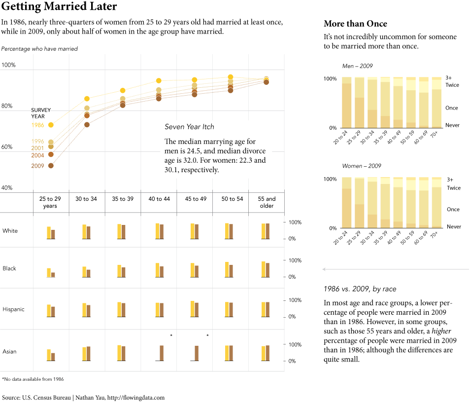
The survey of about 39,000 households was actually taken in 2009 (The government can be slow sometimes.), but it provides a glimpse of how marriage and divorce has changed when you compare it to surveys from previous years.
My main takeaway was that people appear to be getting married at an older age, and as you get into the older age groups, the percentages for people who have married at least once are in the high 90s. The former doesn’t surprise me simply because it matches with personal observation. The second part though was slightly surprising. For some reason, I always thought there were more people who went their whole lives without getting married.
Can you find any other interesting tidbits in the data?
18 Comments
Become a member. Support an independent site. Make great charts.
See What You Get


The combined 55+ histogram bin is a little misleading, because it looks to be the same width as the previous ones. However, it is much less sensitive to temporal variation as it covers a larger age bracket, creating the appearence of a greater convergence of survey results than is the reality.
Neat, I just tweeted “Marriages by age” http://data.is/kjfeEQ (it’s Iceland, but the pattern is probably common to most western countries). Striking reversals also in marital status http://data.is/iNqHPY and age http://data.is/mQuQaS of mothers at childbirth.
Of all races, black people are less likely to be married this is true in 1986 and even more so in 2009. Overall there has been a decline in commitment across all races
Nathan,
Congrats on the Anniversary, btw!
MANY BLESSINGS!
Peace and All Good!
Michael
Thanks, Michael.
FM pointed out the collapsed last bracket. It is also helping to hide the cohort effect. Anyone surviving who was in the last bracket in 1986 still is.
According to the ACS data, there is already a huge mismatch between available men and women for women now in their 50s. Women who have never married by their 50s are unlikely to. Wonder if this dataset shows the same thing?
Finally, cool graphics! Can you explain how you made them and how you used person weights? My students will want to know!
@Econprof – I made these in Illustrator. A brief tutorial here:
https://flowingdata.com/2008/12/16/how-to-make-a-graph-in-adobe-illustrator/
And of course, for more in-depth guidance, you can pre-order the FD book, Visualize This :)
https://flowingdata.com/book/
“For some reason, I always thought there were more people who went their whole lives without getting married.”
My guess is that you know a good number of childless divorced people that you think have never been married. Some of my divorced friends were “single friends” before I found out that they had been married for a year in their early 20s.
I’d be interested in seeing a breakdown of this by state or by region. I went to college in Iowa, and it seemed like every year around graduation there would be a lot of couples getting married; back home in New York I know very few people who’ve gotten married. I’m wondering if there’s really a difference or if it’s just a matter of perception?
If such a high percent of people in the US marry at some point in their lives, and if sexual preference surveys are at all accurate, then very few heterosexuals must go their entire lives without marrying. Do married people, otbe, live longer? Maybe the never-marrieds just drop out of the results if /not marrying/ does correlate with a shorter life…
I thought that there was a recent trend of more people getting married younger (<28). Anecdotally, I know a lot of my recent college graduate friends who got married immediately out of school.
Those born between 1942 and 1946 are plotted in the 40-to-44 column in the 1986 survey and in the 50-to-54 column in the 1996 survey. The percentage who have married (at any time) decreases between these two samplings. This can only be the case if more marrieds died than singles between 1986 and 1996 in that cohort, and this runs counter to mortality reports that I have seen.
From a discusson amongst some friends on Facebook – why is marriage always held up as the benchmark of good relationships?
I wish there was an easy way to track whether this also indicates an overall shift away from committed monogamous relationships. Everyone assumes that marriage means stability and commitment, but many people have marriages that are dysfunctional and stay in them for “the wrong reasons”. Similarly, a lot of people who aren’t married still have relationships that are functional and don’t feel the need to formalize their relationships.
The assumption that marriage represents a “healthy” relationship is pervasive, but I don’t think it accurately sums up the whole picture. I wish more studies focused on the characteristics of relationships rather than the simple binary “Are you married?” I guess we’re fated to base data off of what’s easiest to track though.
Does anyone know of some boad studies that address the qualitative aspects of relationships rather than simply whether certian relationships are granted a special legal status over others?
@Tom: The Family Transitions Project is research project based out of Ames, IA. I believe that many articles have been published with regards to relationship quality, however I’m not sure the sample will be broad enough for what you’re looking for. The size is about 550 families all who originated in Iowa, however not all of the couples/families still live in Iowa. Feel free to browse and see if you find anything helpful! https://transitionsproject.ucdavis.edu/publications.htm
I guess I am a little off the norm. I first married at 23 and am on my third wife at 40. I do feel the data lags and is slightly under reported in terms of re-marriage.
The graphs are difficult to assess, given the similarity of colors. I understand the idea of different shades of a single color – but it would have been visually better if the shades were a bit more different, or contrasted with the white background better. **especially** the bar graphs on the right hand side.
Nice information. While not addressed, I would be interested in the *relative* marriage rates of spouses. I married at 24, then re-married at 37 to a man who was also 37, but who had never been married. Is one age group more likely to marry someone who had been married multiple times? Or is someone previously married more likely to marry at all?
I think more than getting married is the duration. Any charts, data on the duration of marriages.
With three marriages by the age of 40 I am really unusual. I always knew I was special. Congrats on the anniversary.
Durations so far 2.5yrs, 10yrs, 2yrs and counting