You might recall that the United Nations Statistics Division launched UNdata about one week short of a year ago, which was an improvement on the previous United Nations Commons Database. UNdata provides a gateway into 22 United Nations databases and 66 million records. Yeah, it’s a lot of data, but what do we do with it? What does it mean? Progress: A Graphical Report on the State of the World is a modest attempt to make some sense of it all; and by all, I mean a small subset.
I took a step away from code, opened up Adobe Illustrator and R, and did my best to visualize important topics like mortality, population, energy, and environment. It’s amazing what you learn when you start digging into data. Did you know the average Niger woman will have seven children in her lifetime?

Some of the report is the graphs that you’re used to while a couple were for fun and experimental. Check it out, and let me know what you think (and if you find any mistakes).
A Note About the Data
If you want some real data to work with (as opposed to the clean, fake kind), UNdata is an excellent place to find it. It’s sparse, scattered, and oftentimes hard to figure out what the data are about – which is what you should expect. Although for some odd reason I wasn’t expecting it to be so tricky to navigate. In any case, you’ll notice that some of the pages show only select numbers for certain countries. It’s most likely because there wasn’t all that much data for that metric… or I just thought the factoid was interesting. More likely the former though. The further back in time you go, the more sparse the data gets.
Anyways, this was fun and I think I’ll do it more often. It was nice to get back to where it really all began for me. Any suggestions for the next series of graphics?
 Visualize This: The FlowingData Guide to Design, Visualization, and Statistics (2nd Edition)
Wow. Great layout and interesting charting. I am not a big fan of the fertility map though, the crossing lines confuse me and they are not even necessary after all. Or did I miss a joke there ;)
Other than that, I really like it!
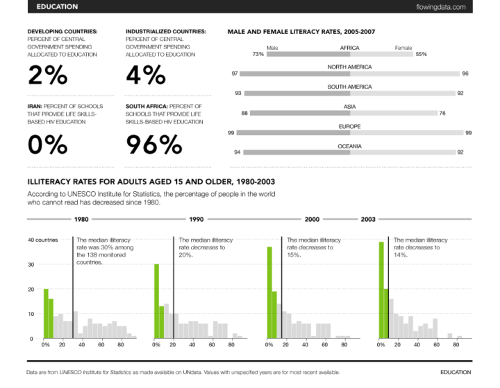
Funny (or ironic), that in the first graph, it’s speaking of literacy rates, and “literacy” is misspelled.
@Derek – that was so on purpose :). fixed
great job. what tool do you use?
The greenhouse gases percent changes chart gave me a cognitive overload. Is there any way to describe the same info that requires less mapping and processing by the viewer?
On the Births page, Chad and Burkina Faso (east and west of Niger) are highlighted on the map but not listed on top, and have no lines to them.
Thanks, Amos. Got it.
Pingback: links for 2009-03-03 - Kevin Bondelli’s Youth Vote Blog
Pingback: Daily Research » Shared Items - March 3, 2009
Hi Nathan, shouldn’t be the life expectancy for developing countries 67 years?
Developing countries Total 2007 UNICEF_SOWC_2009 Years 67
Great Visuals! Thnxx for the inspiration!
SM!
This looks really nice however, some of the charting detracts from the intent for example the opposing bars for literacy between men and women obscures rather than highlights the difference between the groups since it is very challenging to see the differences in bar lengths when opposed that way (this is true for all the opposing bar charts). Additionally using stack bars to compare different time periods is misleading or misdirecting as stacks generally serve to illustrate ratios within one time slice rather than across multiple. I also second ayemoah’s comments on greenhouse gases. I understand you wanted to demonstrate some charting capabilities, but effective data visualization will prioritize the illustration or clarification a complex story above pretty charts. Even if it’s boring it’s better to pick the chart that meets this objective.
I say good work by you Nathan!
Overall this is great. I suffered a bit from chart fatique having to mentally switch thought processes between different styles of chart. Lots of mental “loading time”. /but it’s grea tto see someone make use of the data. And the greenhouse gas chart was my favorite.
@Jess – thanks for the tip. didn’t give much thought to flow this time around. next time though :)
Pingback: | The Lunar Society
Very well done. I’m actually a bit moved by the data being presented here. Sure, we can all talk about the different means of presenting the data, but let’s not forget the practical application that’s come from this- you’ve provided a great service to the world by turning all of that UN data into actual information.
I wish this was many, many pages longer. Any chance of expanding the small subset you’ve provided us with? Maybe some crowdsourcing opportunity here?
@John – I was planning on adding as many pages as I could, but I _really_ like the crowdsourcing idea. Hmmm…
Pingback: A Graphical Report on the State of the World | schneiderism
will volunteer to help.
request style guide and compliant software!
FYI: the R Project link is not working.
http://www.r-project.org will work, but plain r-project.org doesn’t. Their issue IMHO but not all of your readers will realize how to fix it. :)
Pingback: Artistic Data | alex j. mann (.com)
Pingback: Nathan Yau: Painting change by the numbers | The Pop!Tech Blog | Accelerating the Positive Impact of Worldchanging People and Ideas
Pingback: Vooruitgang | Computertaal
Pingback: digestif | demographics