After two weeks at Visualizar, I’m back in the United States. It’s good to be back. I don’t know how many people know this (because I certainly didn’t), but the people in Madrid (or all of Spain?) eat a ridiculous number of sandwiches. I spoke to a couple of locals who said it’s pretty common to eat two sandwiches a day every day. I’m all sandwiched out.
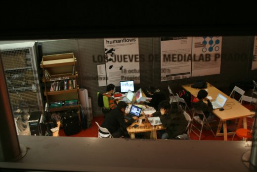
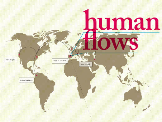
Anyways, the Visualizar symposium / workshop was a lot of fun, really interesting, and I ended up learning a lot more than I expected from some incredibly talented people. During my two weeks, I had the opportunity to work with designers Miguel Cabanzo, Iman Moradi, and Monica Sanchez and we managed to build a visualization framework that shows migration data with economic indicators. We call the piece humanflows.
Human Flows, the Piece
I just tried putting humanflows online, but of course it’s not working on my server right now (because all computers are against me), so I settled for a couple of screencasts. You’ll just have to take my word for it that the whole thing came together really nicely with a kiosk-looking type setup and a designer’s touch (three of them, actually). The visualization itself was done in Processing.
Here’s the first one that just shows the flows. Right off bat, you can see the huge rush to the United States (especially immigrants from Mexico).
This one shows the flows with unemployment rate.
We also did one with GDP, but you get the idea.
Of course, now that we have a framework, there’s so many other things that I can think of adding. Functionality like specific country selection and the ability to browse through other indicators would really allow some serious data exploration and since we were working with data form the United Nations Common Database, which has a hundreds of publicly available datasets, there’s a lot to work with.
So there it is. Humanflows.
Through the development process, I learned a lot about what I can do with Processing as well as gained an entirely different perspective on data visualization — a designer’s perspective. Simple concepts like color and more complex ideas like how to approach a large dataset are some of the things that I learned that I think are important for statisticians and the more technically-involved data people to know. I’ll cover that stuff in later posts though.
For now, I’d appreciate any comments on our visualization and any ideas on how to improve it. How would you visualize migration data?
 Visualize This: The FlowingData Guide to Design, Visualization, and Statistics (2nd Edition)
Have you seen this paper on ‘Flow Map Layout’? http://graphics.stanford.edu/papers/flow_map_layout/flow_map_layout.pdf
Flow maps have some nice space saving properties. Using line thickness seems intuitive & is probably pre-attentive too.
I don’t know whether it would work with your data, but it might be worth trying?
Joe
could you let me know once it is online?
could you let me know once it is online?
@joe: No, I haven’t seen that paper, but it looks interesting. I should’ve known there was bound to be work done on how to represent flows on a map. Thanks.
@infosthetics: Yeah, of course!
It’s all of Spain…everywhere you go in Barcelona there are signs for “bocadillos.” I actually thought it was just Barcelona! haha
from the guys at yahoo, there’s a new project in the processing site about visualization… seems interesting
Pingback: Please Take Note » Blog Archive » Visualizar: Humanflows