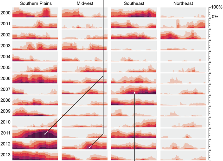
For Scientific American, Cédric Scherer and Georgios Karamanis charted drought extent by region using a grid of stacked bar charts. Each cell represents a year for a corresponding region, and color represents drought intensity.
Compare this view to more map-centric ones. This version focuses more on time than it does geography. One isn’t better than the other. Just different.

 Visualize This: The FlowingData Guide to Design, Visualization, and Statistics (2nd Edition)