Edwin Chen, a data scientist at Twitter, took an in-depth look at what people are more inclined to tweet on Twitter and like on Facebook. He used FlowingData as his main data source, but also analyzed Quora, xkcd, and New Scientist. The main finding:
Twitter is still for the techies: articles where the number of tweets greatly outnumber FB likes tend to revolve around software companies and programming. Facebook, on the other hand, appeals to everyone else: yeah, to the masses, and to non-software technical folks in general as well.
I saw the analysis when it was posted over a year ago but never got around to sharing it. It crossed my desktop again recently. The results still seem to apply.
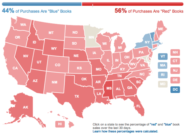
From a practical standpoint, I don’t think about whether or not people are going to share something more on Twitter or Facebook before I post it. I just link to what I think is interesting. However, when I post something with a poop or fart joke in it (so half the time, basically), I make sure I share it on Facebook, which I have to do manually. Because you know, bowel movements have universal appeal.
 For the past ten years, researchers have been tagging hump back whales in the Gulf of Maine with a temporary tracking device called a
 Visualize This: The FlowingData Guide to Design, Visualization, and Statistics (2nd Edition)


