Visualization
Showing the stories in data through statistics, design, aesthetics, and code.
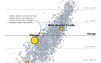
Where students learn the most
Emily Badger and Kevin Quealy, reporting for the Upshot, highlights research from Sean…
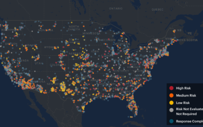
Bomb contaminants where you live
Lena Groeger, Ryann Grochowski Jones and Abrahm Lustgarten, reporting for ProPublica with a…

High-detail landscape using lidar data
Lidar, which is like radar but with lasers instead of radio waves, can…
Stopping a nuclear missile fired at the US
I hate that this feels like something civilians should know. Bonnie Berkowitz and…
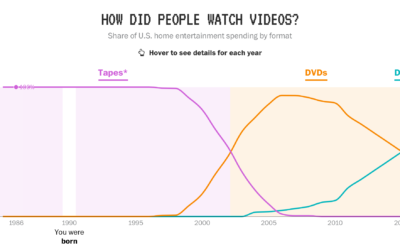
Tech generations, as seen through video source, music players, and internet access
In a fun piece by Reuben Fischer-Baum, reporting for The Washington Post:
In…
Middle-class tax cuts and increases from Senate bill
A lot of tax debate centers around the “average” American family, with focus…
Chart search popularity
Anna Vital, in collaboration with the Google News Lab, shows the search popularity…
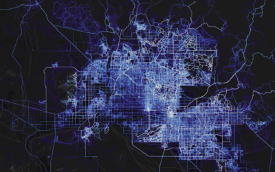
Global cycling and running heatmap
A few years back, cycling and running app Strava mapped the paths of…
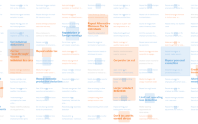
Every tax cut and increase in House Republicans’ bill
The House Republicans will vote on a tax bill soon that adds about…

How generative music works
Generative music comes from the design of a system that produces notes that…
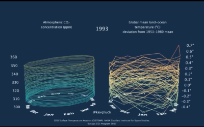
3-D tube chart of global CO2 concentration and temperature
Because you can never have enough time series charts that show increases of…

Looking for patterns and structures from the sky
Photographer Bernhard Lang takes pictures in small planes and helicopters, pointing his camera…
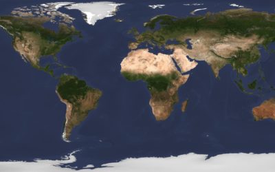
A daily high-resolution image of Earth
Planet monitors Earth with hundreds of satellites, and after six years, they’ve built…
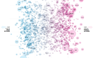
The words used by men and women to write about love
Josh Katz, Claire Cain Miller, and Kathleen A. Flynn for The Upshot plotted…
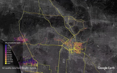
Google maps street-level air quality using Street View cars with sensors
Google equipped their Street View cars with air quality sensors and sent them…
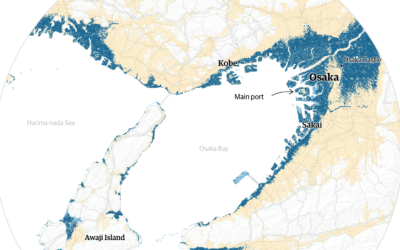
Cities projected to be under water by 2100
Using Climate Central sea-level rise estimates, The Guardian plots and maps the potential…
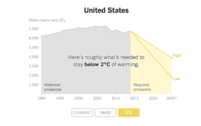
Carbon emissions goals vs. current paths
Brad Plumer and Nadja Popovich reporting for The New York Times:
Under the…
Visualization song release
Ukranian band Obiymy Doschu released a new song Razom. “It’s a uplifting and…