Visualization
Showing the stories in data through statistics, design, aesthetics, and code.
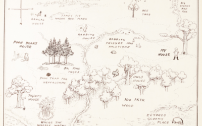
Original map of Winnie-the-Pooh’s Hundred Acre Wood
The ink-drawn map of Hundred Acre Wood by Winnie-the-Pooh illustrator E. H. Shepard…
Imagining gigantic places with satellite imagery
Artist Marcus Lyon imagines worlds where there are so many people that the…
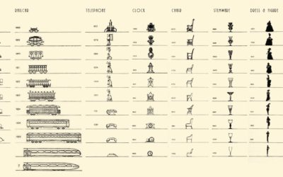
Vintage chart shows the evolution in design of everyday objects
By Raymond Loewy, this chart from 1934 shows the shifts in design of…
Nigel Holmes new illustrated book on Crazy Competitions
Nigel Holmes, the graphic designer known for his playful illustrated graphics, has a…
A visualization game to understand education and school segregation
Educate Your Child by Gabrielle LaMarr LeMee uses census data and the school…
Subway delays visually explained
Adam Pearce for The New York Times describes the sad state of affairs…
What data visualization is for
Eric Rodenbeck from Stamen Design discusses visualization the medium over visualization the tool…
Comparison of terms and conditions lengths
Most of us don’t read the terms and conditions before we click on…
Tweeting a map of every Census tract in the United States
By Neil Freeman, the @everytract bot on Twitter, as the name suggests, is…
Mapping a diverse but segregated America
Aaron Williams and Armand Emamdjomeh for The Washington Post delve into diversity and…
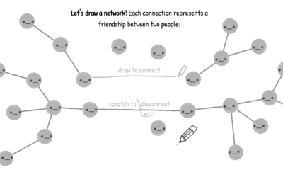
A game to better understand the wisdom (and madness) of crowds
You’ve probably heard of the wisdom of crowds. The general idea, popularized by…
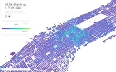
All the buildings in Manhattan in 3-D map
Taylor Baldwin mapped all of the buildings in Manhattan using a 3-D layout.…
Get all caught up with The Avengers using this timeline
It’s been a decade since the first Iron Man movie, and some 30…
Waiting Game, through the steps of asylum seekers
Sisi Wei for ProPublica and Nick Fortugno of Playmatics made a game to…
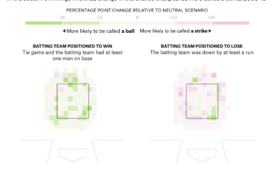
Umpire strike zone changes to finish games earlier
When watching baseball on television, we get the benefit of seeing whether a…
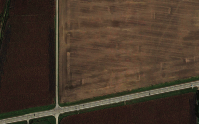
Shapes we make, seen from the sky
Look from the above at the shapes and geometry we use for cities,…
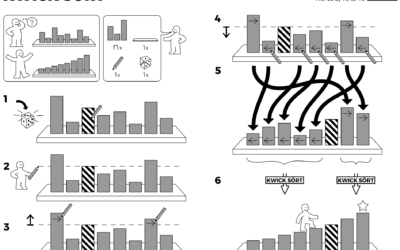
Algorithms drawn as IKEA furniture instructions
Learning algorithm steps can be a challenge when viewed only through code or…

