Visualization
Showing the stories in data through statistics, design, aesthetics, and code.
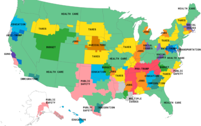
Maps of the issues mentioned most in election advertising
As the midterm elections loom, the ads focusing on key issues are running…
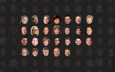
Faces of diverse midterms
As one might expect, many women, people of color, and L.G.B.T. candidates are…
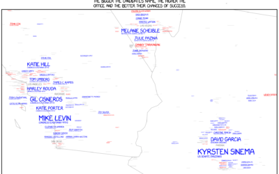
xkcd maps 2018 midterm election challengers
Randall Munroe, Kelsey Harris, and Max Goodman for xkcd mapped all the challengers…

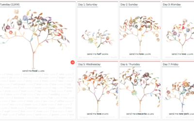
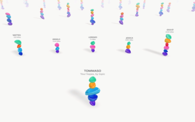
Tree visualization to represent texting interactions
Shirley Wu used a tree metaphor to represent the interactions of five individuals…
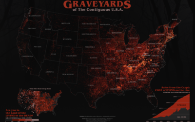
Graveyards of America mapped
It’s Halloween. Joshua Stevens mapped all the graveyards:
Right away I was struck…
Interactive comic to remember things better
In a time we commit less to memory and rely more on technology…
Visualizing science
Jen Christiansen spoke about her extensive experience as a graphics editor for Scientific…
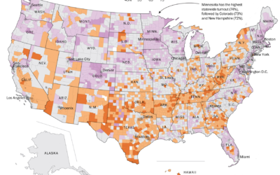
Geography of voter turnout
Based on data from Dave Leip’s Atlas of U.S. Presidential Elections, The Washington…
Building statues of hope in augmented reality
Accurat, in partnership with the Google News Initiative, built an augmented reality app…
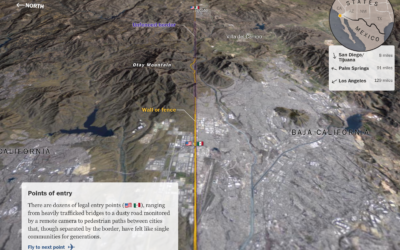
A closer look at the U.S.-Mexico border
The Washington Post provides a flyover view of the barriers at the U.S.-Mexico…
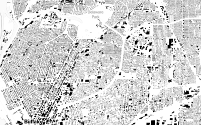
Mapping all the buildings
A few months back, Microsoft released a comprehensive dataset that included the estimated…
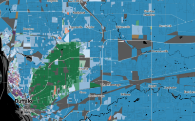
Mapping predominant race block by block
Based on data from the Census Bureau, National Geographic mapped predominant race in…
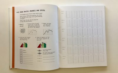
Create your own visual journal of data
Giorgia Lupi and Stefanie Posavec continue on their path of Dear Data with…
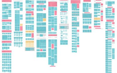
News homepage design overview
As you click through the news, you can probably almost always figure out…
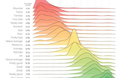
Measuring the varied sentiments of good and bad words
There was a survey a while back that asked people to provide a…
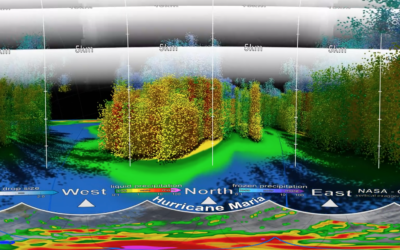
Inside Hurricane Maria, a 3-D perspective
This 3-D view inside Hurricane Maria, from NASA’s Scientific Visualization Studio and NASA’s…