Visualization
Showing the stories in data through statistics, design, aesthetics, and code.
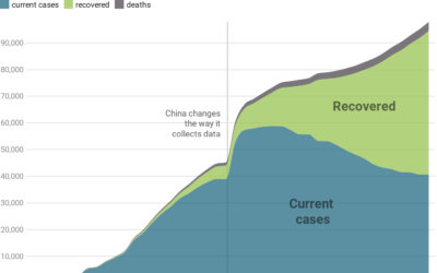
Responsible coronavirus charts
Speaking of responsible visualization, Datawrapper provides 17 charts and maps you can use…
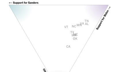
How different groups voted on Super Tuesday
The New York Times has a rundown of what happened on Super Tuesday,…

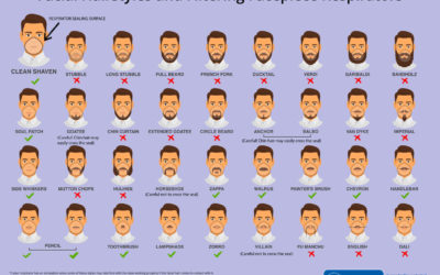
Face mask respirator and its usefulness with different beard styles
The Centers for Disease Control and Prevention made this graphic to show what…
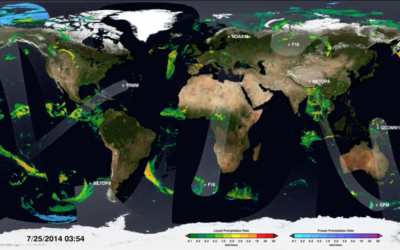
Map shows how NASA satellites collect global rain data
We can download data as a single snapshot in a single file, but…
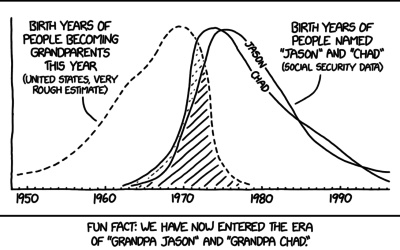
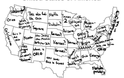
Grandpa Chad distribution
xkcd crossed a rough age distribution of people becoming grandparents with people named…
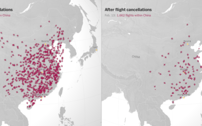
Canceled flights due to coronavirus
With an animated side-by-side map, The New York Times shows canceled flights in…

Map of mathematics
The Map of Mathematics from Quanta Magazine explains key concepts with animated visualizations:…
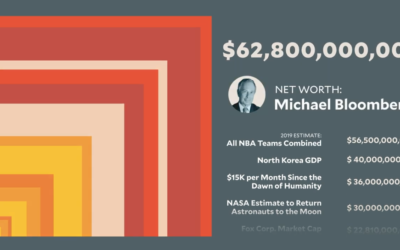
Scale of Bloomberg net worth
While we’re on the topic of Mike Bloomberg’s money, here’s another view from…
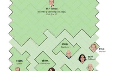
Bloomberg ad spending, relative to other candidates’
Mike Bloomberg’s ad spending might not be that much relative to his own…
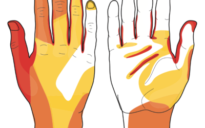
Most often missed areas while washing hands
This graphic from WakeMed shows the areas most often missed while washing hands.…
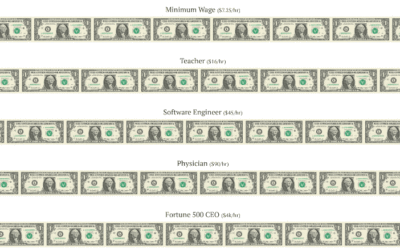
Printing money at the speed of various wages
Neal Agarwal used a money printing metaphor to depict differences in various wages.…

Blanket visualizes daily high and low temperatures
Reddit user quantum-kate used daily high and low temperatures in Denver in 1992…

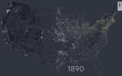
Mapping the construction of railroads in America
For the Financial Times, Alan Smith and Steven Bernard traced the history of…