Visualization
Showing the stories in data through statistics, design, aesthetics, and code.

Why time feels weird right now
For Reuters, Feilding Cage provides a series of interactive tidbits to demonstrate why…
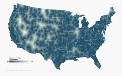
Map shows where to go to get away from fireworks
Using a voronoi map, David Yanofsky for Quartz mapped the places in the…
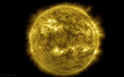
Decade-long time-lapse of the sun
NASA’s Solar Dynamics Observatory has been taking a picture of the sun every…
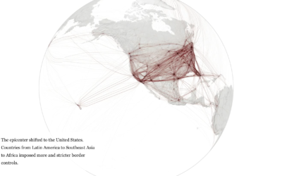
When the world shut down, seen through global flights
Lauren Tierney and William Neff for The Washington Post used a rotating globe…
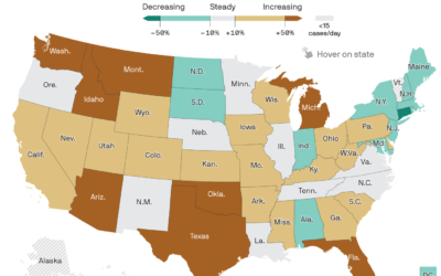
Map of Covid-19 surge
Axios provides a straightforward state map showing the percentage change in the 7-day…

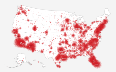
How the coronavirus won in the United States
Using a wide array of sources, The New York Times shows how the…
Who is responsible for climate change?
Kurzgesagt, in collaboration with Our World in Data, tackle the question of who…
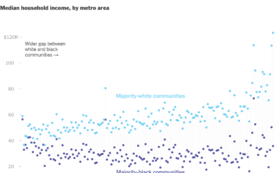
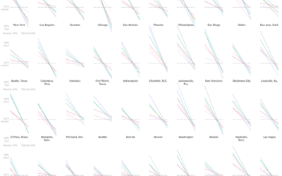
Gaps between black and white America
New York Times Opinion compared several demographics, such as unemployment and income, between…
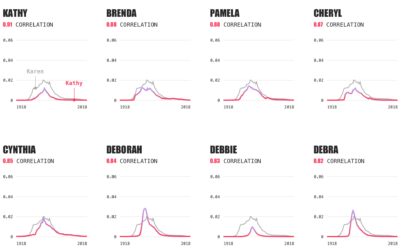
Karen equivalents, based on name data
The name Karen. It’s not a common baby name these days. It peaked…

Making a map table using IKEA furniture
All you need is an old table, gift wrapping paper, and some varnish.…

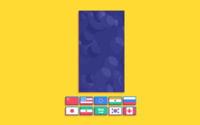
Data visualization wallpaper
As a 100-day project, Alli Torban has been imagining what a data visualization…
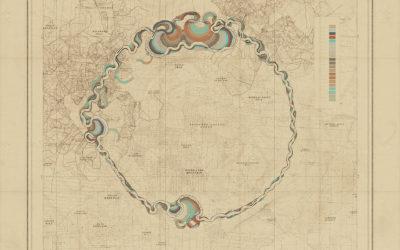
Meandering procedural river maps
Robert Hodgin built a procedural system he calls Meander to generate the beauty…
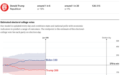
2020 election forecast
The Economist launched their 2020 elections forecast. Right now a part of my…
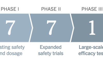
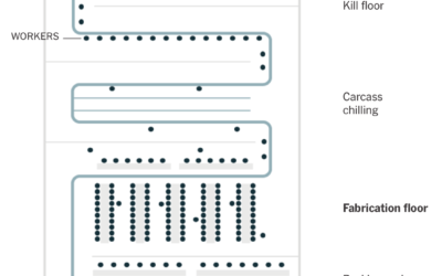
Challenges of reopening the meatpacking plant
To reopen safely, meatpacking plants have to take precautions to provide space and…
Health conditions and income
A large proportion of those who died from Covid-19 had pre-existing medical conditions.…
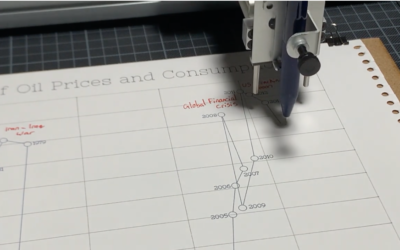
Pen plotter used as storytelling device
Pen plotters slowly draw out a picture line-by-line, so when you watch a…