Visualization
Showing the stories in data through statistics, design, aesthetics, and code.
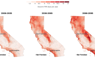
More fire weather days coming
It’s been smoky this season. Based on research from Michael Goss et al.,…
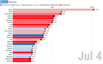
Covid-19 cases and state partisanship
From Dan Goodspeed, the bar chart race is back. The length of the…

Visual tour through the technology hype cycle
The Gartner hype cycle is a graphical representation of where certain technologies are…
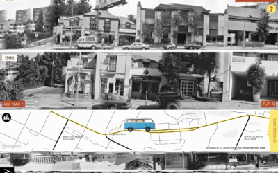
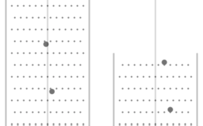
Exploration of 12 timelines along Sunset Boulevard
In 1966, artist Ed Ruscha published Every Building on the Sunset Strip, which…
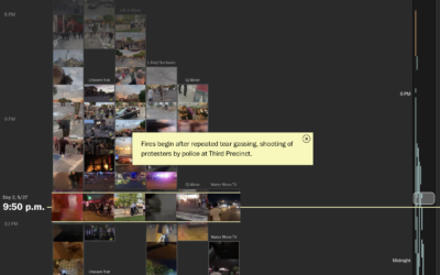
Reconstructing protests in Minneapolis using hundreds of livestreams
From a distance, it’s difficult to build an understanding of the scale and…
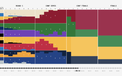
NBA playoff win probabilities, animated over time
FiveThirtyEight publishes win probabilities for NBA games throughout the season. During the playoffs,…
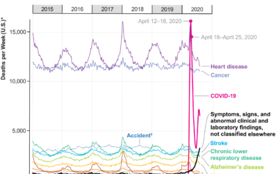
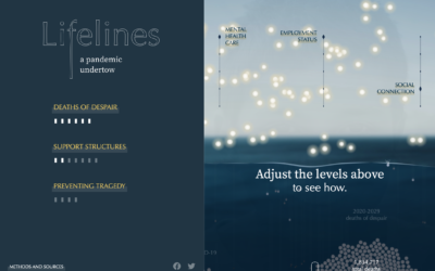
Covid-19, the third leading cause of death
For Scientific American, Youyou Zhou made a line chart that shows cause of…
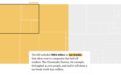
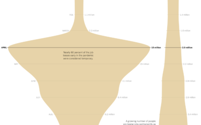
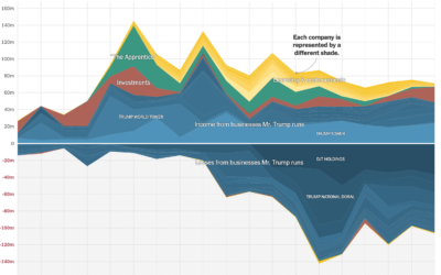
Breaking down the $4 trillion bailout
Using a straightforward treemap, The Washington Post looks at where the $4 trillion…
Presidential Plinko
To visualize uncertainty in election forecasts, Matthew Kay from Northwestern University used a…
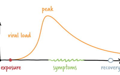
Coronavirus infection timeline
The timeline for a new infection isn’t the same for everyone. Some never…
Sonification of Covid-19 rates
You’ve seen the line charts showing case rates over time. The focus is…

Millions of people experienced unhealthy air in 2020
NPR estimated how many people have experienced unhealthy air this year, largely in…
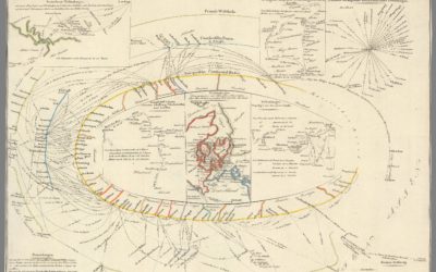
Exhibition of historical visualization
RJ Andrews, in collaboration with the David Rumsey Map Center, curated a collection…

I am a book. I am a portal to the universe.
Stefanie Posavec and Miriam Quick have a new book out called I am…
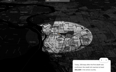
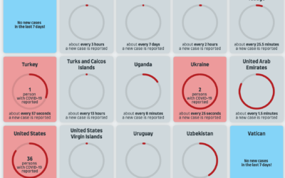
Covid-19 in your neighborhood
With recorded U.S. Covid-19 deaths passing the 200k mark, somehow the number still…