Visualization
Showing the stories in data through statistics, design, aesthetics, and code.

Climate change and uncertainty
In his new data-driven documentary, Neil Halloran digs into the uncertainty attached to…
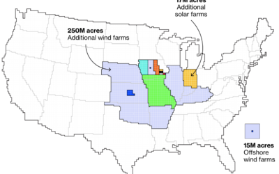
Maps of land required to get to net-zero emissions
Princeton University’s Net-Zero America project analyzes and models the infrastructure required to get…
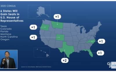
States that gained and lost seats with 2020 count
The Census Bureau announced their state population totals, so we can see who…
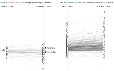
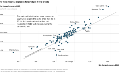
Where people moved during the pandemic
In another look at migration through the lens of USPS change of address…
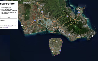
Compare the scale of any area in the world
Riffing on the Ever Given Ever Ywhere, which lets you place the Ever…

Visual deconstruction of popular songs
Nate Sloan and Charlie Harding, for NYT Opinion, look at how the structure…
Maps of migration to smaller cities
Steven Bernard for Financial Times, in a report by Claire Bushey and Steff…
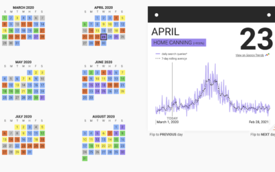
Trending hobbies during the pandemic
This past year has seen a rising interest in long-lost hobbies due to…
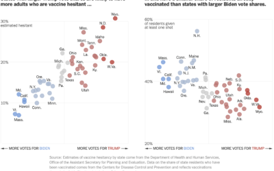
Voting and vaccination rate
Danielle Ivory, Lauren Leatherby and Robert Gebeloff for The New York looked at…

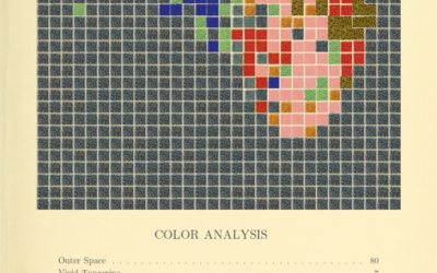
Generate a color analysis by uploading an image
Mel Dollison and Liza Daly made a fun interactive that lets you upload…
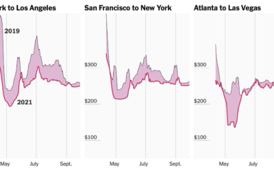
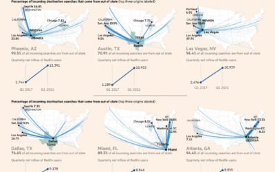
Tracking airfare as a proxy for summer travel plans
Quoctrung Bui and Sarah Kliff for NYT’s The Upshot used difference charts to…
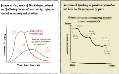
Stopping a pandemic before it starts
For Politico, Beatrice Jin provides an illustrated guide on stopping a pandemic before…
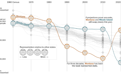
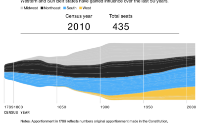
How your state might lose or gain representation with Census count
Harry Stevens, Tara Bahrampour and Ted Mellnik for The Washington Post look at…

Visualizing risk of Johnson & Johnson vaccine side effect
As the Johnson & Johnson vaccine pauses in the United States, Philip Bump…