Visualization
Showing the stories in data through statistics, design, aesthetics, and code.
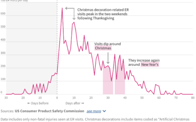
ER visits for Christmas decoration injuries
A lot of Christmas lights went up this past week. I hope you…
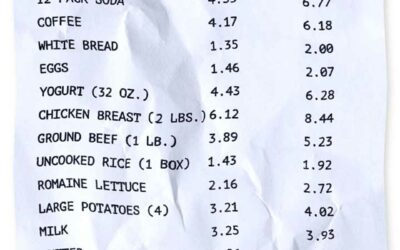
Inflation high, cost of living no good
Usually inflation is more of a slow thing that you don’t notice so…
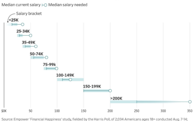
How much more income people need to be happy
For the Wall Street Journal, Joe Pinsker reports on income and happiness, or…
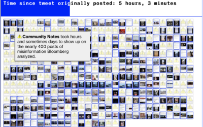
Failed community notes to stop misinformation on Twitter
Twitter has a Community Notes feature that attempts to flag posts that contain…
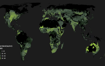
Running out of space to grow food
For Associated Press, Christina Larson and Nicky Forster examined the growing population and…
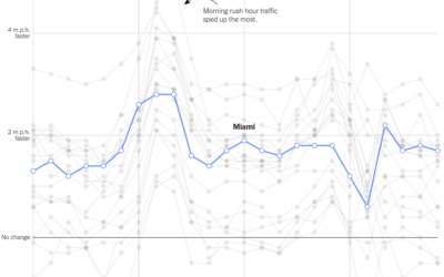
Change in commute times in major cities
Using GPS data processed by Replica, Lydia DePillis, Emma Goldberg, and Ella Koeze,…
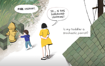
Toddlers and stochastic parrots
For The New Yorker, Angie Wang draws parallels between toddler learning behavior and…
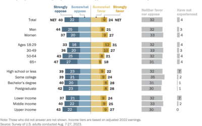
Attitudes towards tipping in the U.S.
Tipping seems to be in a confusing spot right now. On the one…
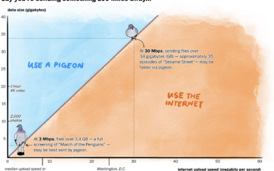
Carrier pigeon vs. internet upload speeds
In some rural areas, upload speeds are crawlingly slow, which can make it…
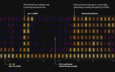
Premiums on electricity during Covid lockdowns in Italy
During Covid lockdowns, power companies in Italy charged premiums to cover increased prices…

Claim file request generator
Health insurers reject claims often, and if this happens, you can file an…

Animated map shows the search for the best path
When you look up directions with a mapping application, there are algorithms that…
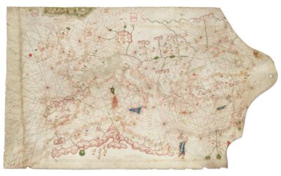
Historical chart valued at $7.5m
The map sold for $239,000 at a Christie’s auction, but it was misdated…

Music theory in interactive visuals
muted.io is a set of visual tools to help you learn music theory.…
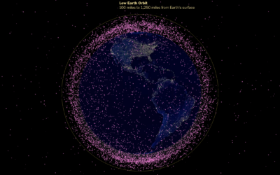
Thousands of satellites orbiting Earth
The Washington Post looked at the many satellites orbiting our planet. A globe…

Maui fires timeline, a visual reconstruction of the events
Using a combination of weather reports, videos, and 911 calls, The New York…
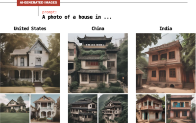
Demonstration of bias in AI-generated images
For The Washington Post, Nitasha Tiku, Kevin Schaul and Szu Yu Chen demonstrate…