Visualization
Showing the stories in data through statistics, design, aesthetics, and code.
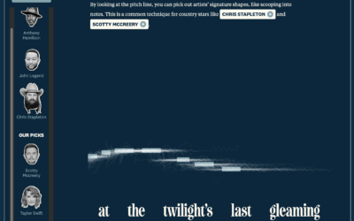
Diva-ness of national anthem renditions
You’ve probably heard various renditions of The Star-Spangled Banner, and sometimes singers put…
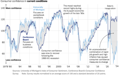
Consumer confidence in current economic conditions
For NYT Opinion, Nate Silver compares consumer confidence between two surveys. The University…
Your body as a processing plant, digesting a hot wing
Your body goes through a special process to digest spicy food. The sting,…
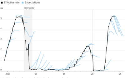
Investor expectations for interest rates compared to reality
This chart by Eric Wallerstein for the Wall Street Journal shows expectations against…
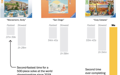
Speed puzzling times and strategies
There are competitions where people complete jigsaw puzzles as quickly as they can,…
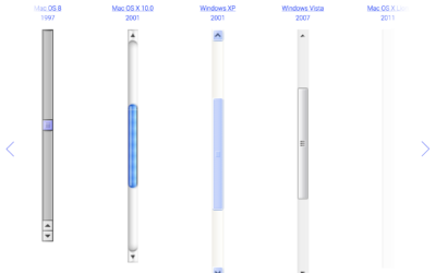
Evolution of the scrollbar
Sébastien Matos used a straightforward view to show the evolution of the scrollbar,…
Researchers might have found Amelia Earhart’s crashed plane
For NPR, Juliana Kim reports:
Deep Sea Vision, an ocean exploration company based…
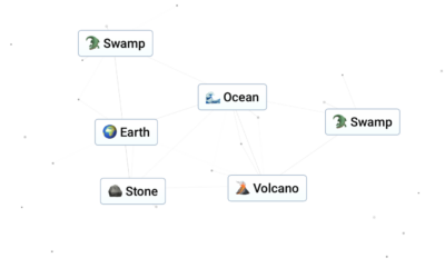
Infinite Craft with large language model
Start with water, fire, wind, and earth and see what you can craft…
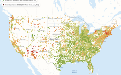
Cost of a Big Mac at every McDonald’s in the United States
A map, by Pantry & Larder, shows the cost of a Big Mac…
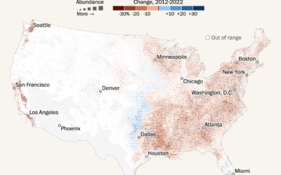
Shifting bird populations
Using data from the crowdsourced database eBird, Harry Stevens mapped the shifts in…
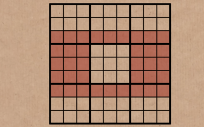
Mathematical feature in all Sudoku puzzles
For Numberphile, Simon Anthony explains the Phistomephel Ring. The shape always contains the…
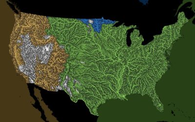
Oceans that all the rivers drain
Rivers drain into oceans. Grasshopper Geography color-coded the rivers in the world by…
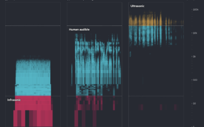
Learning animal languages with AI
Financial Times highlights how researchers are using AI to try to learn what…
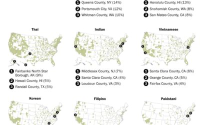
Where restaurants serve Asian cuisines in the U.S.
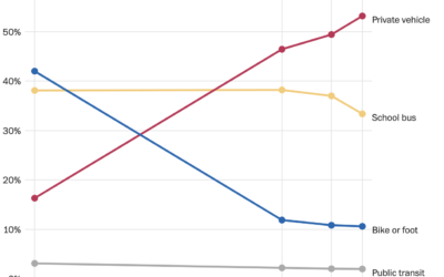
You can find Asian restaurants in most places in the United States, but…
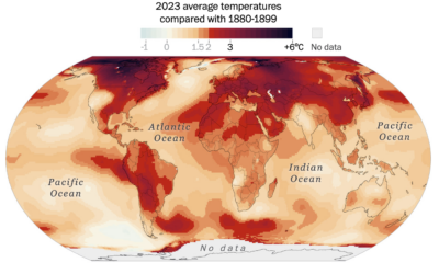
Where it warmed the most in the world
Earth got its hottest year on record in 2023. Based on data from…

