Visualization
Showing the stories in data through statistics, design, aesthetics, and code.
24 Hours of Geotagged Photos on Flickr
Daniel Catt from Flickr maps 24 hours worth of geotagged photos (about 64,000…
Music That Makes You Dumb
Virgil Griffith, a CalTech graduate student, follows up books that make you dumb…
Make This Sitcom Map More Informative
This map from Dan Meth displays popular sitcoms by where they took place.…
Phrase Net Shows the Secret Life of Words
Many Eyes, the social data analysis site, released another visualization tool – Phrase…
New York Times Shines at International Infographics Awards
The infographics and news design blogs have been buzzing the past few days…
Facebook: On the Road to 200 million Users
As we learned last week, Facebook has been growing worldwide ever since it…
Legal Drinking Age Around the World
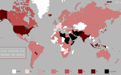
While we’re on the topic of beer (it is Friday after all), let’s…
Where Can You Find America’s Best Beer?
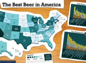
Mike Wirth maps medal winners from the Great American Beer Festival from 1987…
Check In on the State of the Economy
This interesting chart from Russel Investments shows the current state of the economy…
Explore Multiple Time Series in Third Dimension
Roland Lößlein, a media student at University of Applied Sciences in Augsburg, presents…
Little Red Riding Hood, the Animated Infographic Story
Tomas Nilsson, a graphic design student from Linköping University, tells the story of…
AIG Bailout: Where $173 billion Went
Nicolas Rapp and Damiko Morris of Associated Press delve into the AIG bailout.…
Social Weather Mapping From Google Chrome Experiment
In the promotion of its speedy javascript, Google announces the Chrome Experiment. As…
Bus Bench is an Infographic of Guilt
I’ve given a few talks on my work with self-surveillance, and there is…
One Song Sang By 2,088 Voices – Mechanical Turk Rendition
Aaron Koblin and Daniel Massey team up to give us Bicycle Built for…
Review: Data Flow, Visualizing Information in Graphic Design
Data Flow: Visualizing Information in Graphic Design isn’t an Edward Tufte book. It’s…
27 Visualizations and Infographics to Understand the Financial Crisis
I’ve said it before, and I’ll say it again. If there’s anything good…
Immigration Explorer Shows Largest Foreign-born Groups Since 1880
Remember our short contest a while back with immigration rates to the United…


