Visualization
Showing the stories in data through statistics, design, aesthetics, and code.
World Map of Social Network Dominance
Vincenzo Cosenza maps social network dominance around the world according to traffic data…
Javascript InfoVis Toolkit – New Version Released
As we’ve seen, javascript is growing into a viable solution for visualization on…
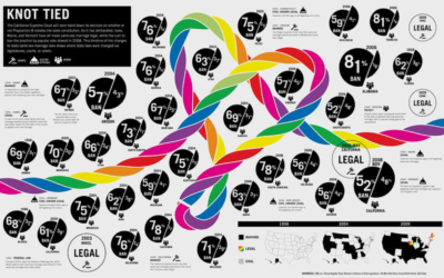
GOOD Magazine’s Infographics Now Archived on Flickr
You know all those infographics that you like so much from GOOD Magazine?…
Possible Futures of Twitter Visualized
We all know Twitter has taken on a life of its own. With…
Déjà Poo: Turning Wastewater to Nonpotable Water
This infographic from Wired explains how Living Machines work to combine waste management…
11 Informative (and Fun) Infographics About Beer
It’s Friday. It’s summer. It’s time to relax in the backyard with an…
Google Analytics Data Made More Informative
A large majority of us who have websites use Google Analytics as our…
Worldwide Obama Buzz Visualized
In celebration of Barack Obama’s 100th day as the 44th President of the…
Open Source Data Visualization Framework – Axiis
Axiis, an open source data visualization framework in Flex, was released a few…
Indieprojector Makes it Easy to Map Your Geographical Data
Axis Maps recently released indieprojector, a new component to indiemapper, their in-development mapping…
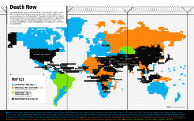
Death Penalty Laws Around the World
With their usual flare, GOOD Magazine maps the death penalty around the world…
Pixel City: Computer-generated City
Pixel City is a procedurally-generated city by Shamus Young. For the non-coders out…
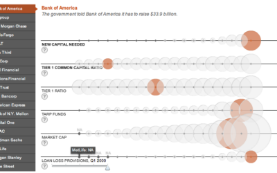
Bubbles Galore in Analysis of Banks’ Financial Health
Andrew Garcia Phillips and Stephen Grocer of The Wall Street Journal compare the…
Maps of the Seven Deadly Sins
Geographers from Kansas State University map the spatial distribution of the seven deadly…
50 Cars to Make One Bus?
Flygbussarna, a Swedish coach bus company, in partnership with the Acne marketing group,…
Interaction Design Pilot Year Churns Out Great Student Projects
In a collaborative initiative between Copenhagen Institute of Interaction Design and The Danish…
37 Data-ish Blogs You Should Know About
You might not know it, but there are actually a ton of data…
Here & There: Horizonless Perspective of Manhattan
Jack Schulze provides this horizonless view of Manhattan:
Here & There is a…


