Visualization
Showing the stories in data through statistics, design, aesthetics, and code.
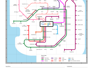
Google Acquisitions Subway Map
Tack another graphic to the growing list of subway map metaphors. Meet the…
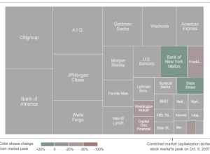
Watch the Giants of Finance Shrink… Then Grow
From Karl Russel and Shan Carter of The New York Times is this…
Infographic Music Video on the Elements – They Might Be Giants
It’s not often you get a Grammy-winning band to play a song for…
Getting a Good Night’s Sleep – Good Night and Tough Luck
Hilarious as always, Christoph Niemann illustrates in his graphical New York Times op-ed…
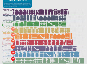
Food Assistance on the Rise
GOOD magazine, in collaboration with Gavin Potenza, takes a look at food assistance…
Earth Through the Eyes of Astronauts
Bella Gaia, or Beautiful Earth, is a unique view of earth through the…
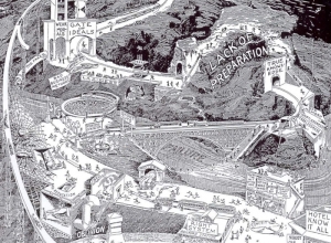
Vintage Infographics From the 1930s
Someone needs to get me a paper copy of Willard Cope Brinton’s Graphic…
3 In-depth Views of Flight Delays and Cancellations
Have you ever rushed to the airport only to find that your flight…
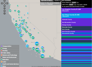
Stimulus Funding Map is ‘Slick as Hell’
As you know, states have received billions of dollars of federal stimulus funding.…
10 More Infographic Reasons Why You Should Go Green
In this day and age, we should all be thinking about how we…
Ben Fry Visualizes the Evolution of Darwin’s Ideas
Ben Fry, well-known for Processing and plenty of other data goodness, announced his…
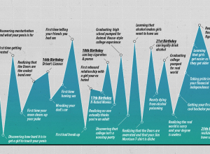
Highs and Lows of Being a Young Man
i-am-bored graphs the horrible to awesome of becoming a man. Growing up ain’t…
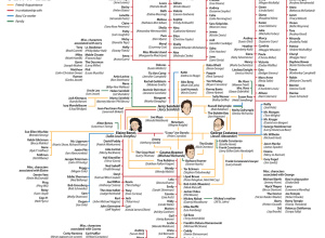
The World of Seinfeld
After yesterday’s weirdness, I’m in the mood for something light.
The show about…
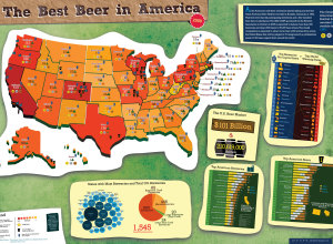
Best Beer in America 2009
Following up from last year’s beer graphic, Mike Wirth looks at medal winners…
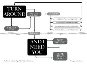
Total Eclipse of the Heart (Flowchart)
Jeannie Harrell takes Total Eclipse of the Heart by Bonnie Tyler, and puts…
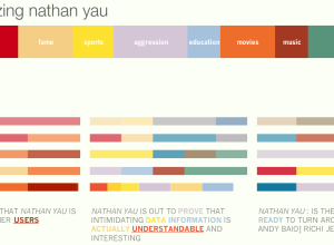
How Does the Internet See You? – Personas From MIT Media
I Google myself every now and then. Everyone does. I don’t know why…

