Visualization
Showing the stories in data through statistics, design, aesthetics, and code.
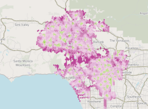
Los Angeles Fire Department response times
Ben Welsh, Robert Lopez, and Kate Linthicum for the Los Angeles Times analyzed…

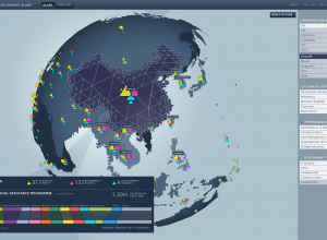
FIFA development work around the world →
Studio NAND and Moritz Stefaner, along with Jens Franke explore FIFA development programs…
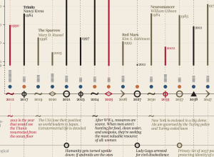
Futures in literature from the past →
After seeing a timeline on future events as described in novels, designer Giorgia…
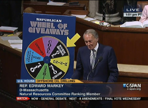
Ridiculous but real charts from the U.S. Congress floor
The Floor Charts tumblr shows actual charts used on the United States Congress…
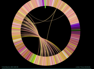
Infinite Jukebox plays your favorite songs forever
You know those songs that you love so much that you cry because…


Beautiful interactive tour of the galaxy
In a beautiful rendition of the galaxy, Google visualized 100,000 stars, starting at…
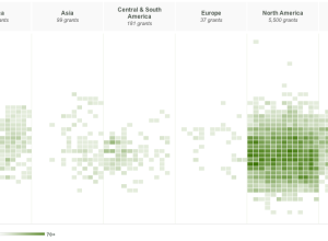
Exploration of Hewlett grants
Since 2000, the Hewlett Foundation has made over 7,000 grants summing $3.86 billion,…
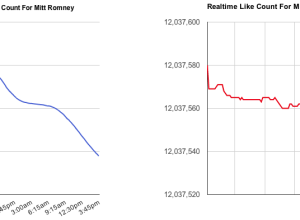
Mitt Romney losing likes on Facebook, in real-time
If you go to the Facebook page for Mitt Romney, note the number…
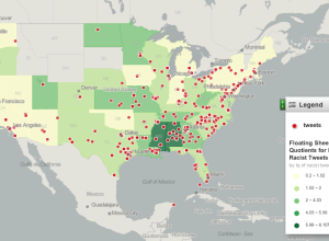
Mapping racist tweets
After seeing this post that highlights racist tweets after the election, Floating Sheep…
Data visualization as cultural phenomenon
In 1979, Joy Division released their album Unknown Pleasures, and the cover was…

Tracking the election tonight
As the results roll in tonight, you have plenty of options to keep…
2012 political donations mapped over time
Following their animated and narrated visualization on political contributions over time, VisPolitics maps…
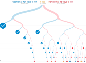
All possible paths to the White House
With the election tomorrow, Mike Bostock and Shan Carter for the New York…
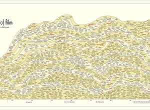
History of film, 100 years in a chart
In something of an homage to the Genealogy of Pop & Rock Music…
Beauty in movement
For the Made by Humans exhibit at the Hyundai Vision Hall in South…