Visualization
Showing the stories in data through statistics, design, aesthetics, and code.
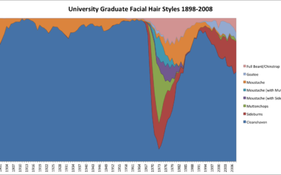
A century of facial hair styles
Facial hair styles change with the years. One year it might be more…
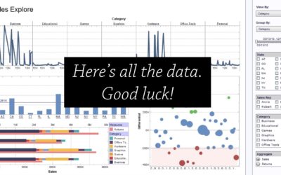
Challenges of visualization in industry
The most recent Data Stories episode with Elijah Meeks is worth a listen…
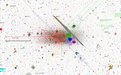
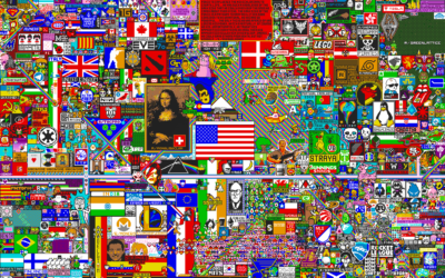
A story of humanity in the pixels of a Reddit April Fool’s experiment
On April Fool’s Day, Reddit launched a blank canvas that users could add…
Listen to soundtrack based on FedEx shipment tracking
FedEx (yes, the shipping company) put up an interactive piece that audiolizes a…
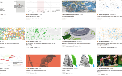
Best infographics in the news
The annual Malofiej Awards is the big one for infographics in the news.…
Time-lapse of community-edited pixels
For April Fool’s Day, Reddit ran a subreddit, r/place, that let users edit…
Visualization as skill set or stand-alone profession
Jumpstarted by Elijah Meeks asking why visualization people are leaving the field for…
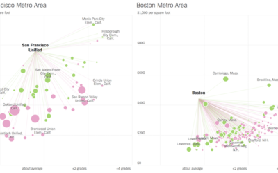
Looking for more affordable homes and better schools in the suburbs
Families often move out of the city to the suburbs for more affordable…
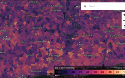
Compare your commute time to others
Commuting sucks. Here’s a straightforward map to compare how much or less your…
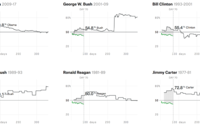
Trump approval ratings compared to past presidents
Using multiple polls as their source data, FiveThirtyEight is tracking approval and disapproval…
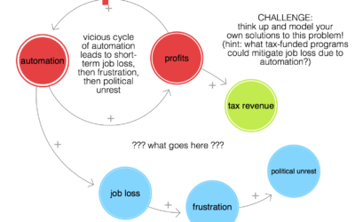
LOOPY is a tool to think in systems
Nicky Case, whose projects to simulate segregation and systems with emoji you might…
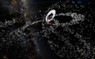
All major meteor showers, as seen from space
There are a lot of meteoroids circling around in space. Ian Webster visualized…
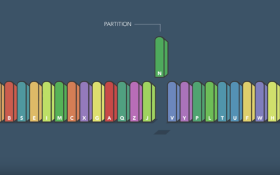
Fastest way to alphabetize your bookshelf
Sorting algorithms. Apparently there are an endless number of ways to visualize them…
Towards simple visualization
Irene Ros, the Director of Data Visualization at Bocoup, talks about her path…
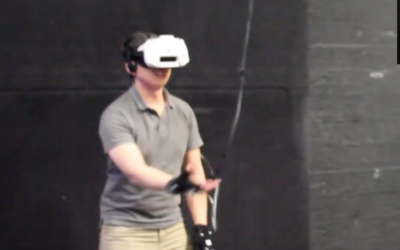
Catching a real ball in virtual reality
Man wears virtual reality headset. Another man throws a ball to headset-wearing man.…
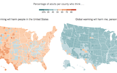
Conflicted public opinion about global warming
Based on estimates from the Yale Program on Climate Change Communication, The New…

