Tutorials
Visualize your data like an expert with hundreds of practical how-tos for presentation, analysis, and understanding.
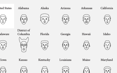
How to visualize data with cartoonish faces ala Chernoff
The goal of Chernoff faces is to show a bunch of variables at once via facial features like lips, eyes, and nose size. Most of the time there are better solutions, but the faces can be interesting to work with.
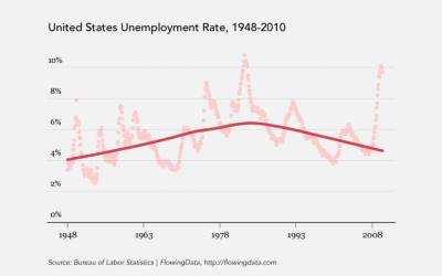
How to: make a scatterplot with a smooth fitted line
Oftentimes, you'll want to fit a line to a bunch of data points. This tutorial will show you how to do that quickly and easily using open-source software, R.
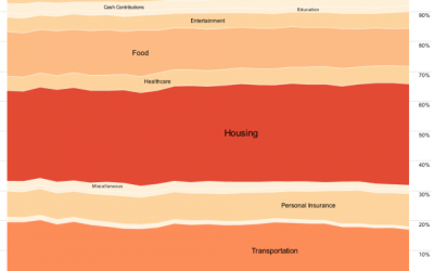
An Easy Way to Make a Treemap
If your data is a hierarchy, a treemap is a good way to show all the values at once and keep the structure in the visual. This is a quick way to make a treemap in R.
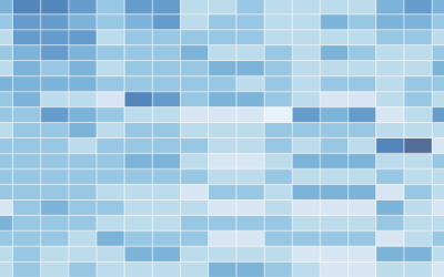
How to Make a Heatmap – a Quick and Easy Solution
A heatmap is a literal way of visualizing a table of numbers, where you substitute the numbers with colored cells. This is a quick way to make one in R.
How to Make an Interactive Area Graph with Flare
You’ve seen the NameExplorer from the Baby Name Wizard by Martin Wattenberg. It’s…
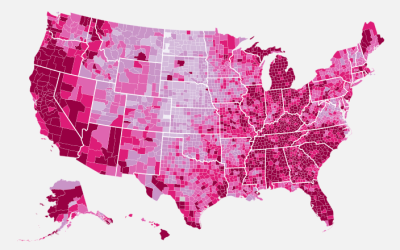
How to Make a US County Thematic Map Using Free Tools
There are about a million ways to make a choropleth map. The problem is that a lot of solutions require expensive software or have a high learning curve. It doesn't have to be that way.
How to Make a Graph in Adobe Illustrator
You can use the vector-based software normally reserved for designers and artists to make and edit charts.
How to Make Your Own Twitter Bot – Python Implementation
Following up on my post last week about using Twitter to track eating…
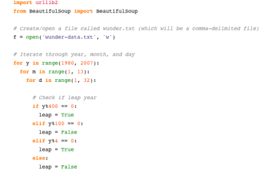
Grabbing Weather Underground Data with BeautifulSoup
Weather Underground is a useful site and a fun place for weather enthusiasts.…