Projects
Graphics by Nathan Yau, borne out of everyday curiosities, learning experiments, and mild insomnia.
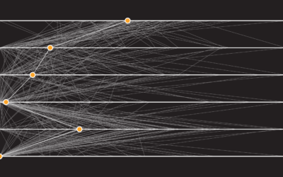
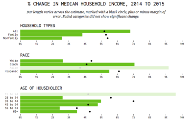
How People Like You Spend Their Time
Looking at American time use for various combinations of sex, age, and employment status, on weekdays and weekends.
Shift Your Point of View to When America Was “Better”
How good or bad something is depends on what you compare against.
Resources to Find the Data You Need, 2016 Edition
This is an update to the guide I wrote in 2009, which as it turns out, is now mostly outdated. So, 2016. Here we go.

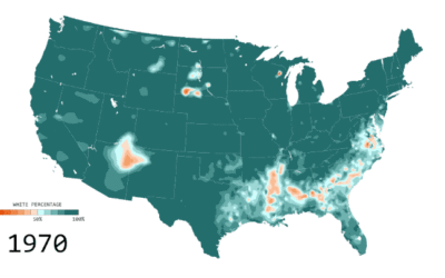
Percentage of white people
Below is the estimated percentage of white population in the United States from…
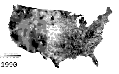
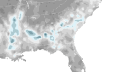
Unemployment in America, Mapped Over Time
Watch the regional changes across the country from 1990 to 2016.
Learning R Versus d3.js for Visualization
For those who work with R and d3.js, the differences between the two…
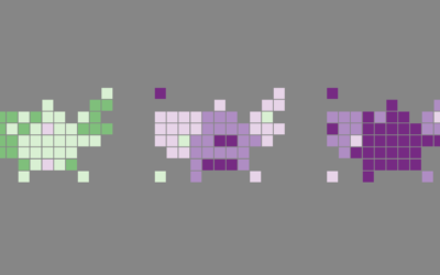
Mapping the Spread of Obesity
A look at the rise for each state over three decades, for men and women.
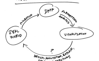
Shorten the Visualization Path Back to Reality
Visualization is complex, but if I were to break it down simply, I’d…
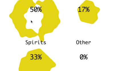
What Alcohol People Around the World Drink
Americans get most of their alcohol from beer, but it's not like that everywhere.