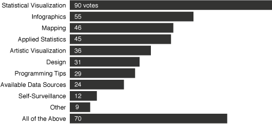
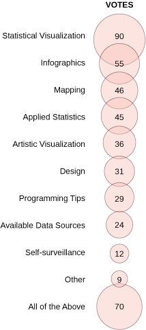
A while back I asked what you wanted to see more of on FlowingData. Thanks to the 447 of you who responded.
I was actually kind of surprised that there were so many votes for statistical visualization. I thought there would be more of a balance between design, art viz, and stat viz. I was, however, happy to see that the second most voted-on choice was “All of the Above.” I must be doing something right! So by popular demand, here’s some statistical visualization.
Pie Chart Alternatives
Since the above pie chart is making some of you cringe in agony (although I can’t imagine why), let’s take a look a few alternatives for the pie chart using the same poll results.
Bar Chart
How about a horizontal bar chart? The results are sorted and you can easily see the difference in voting counts.

Stacked Bar Chart
The above bar chart is missing a little something though. It doesn’t explicitly show that each bar is really a part of a whole – in this case, all the people who voted. How about a stacked bar chart then? It shows the groupings and is a little easier to read than the pie chart in the sense that it’s linear differences as opposed to radial.

Bubble Chart
 Let’s not forget our friends the bubbles. Carrying the same “problems” as a pie chart, the bubbles on the left are essentially a table with some flavor.
Personally, I still like the pie. Which one do you think is best? Or is there something else that might have been better than the above? How about a mosaic plot? Donut graph? A plain table?


Bar chart beats pie chart every time for me!
I’m a little unsure in how to deal with the ‘all of the above’ answer — it doesn’t really fit in with the others since it’s the only one that doesn’t explicitly rank _one_ category of posts in front of the others.
The horizontal bars win every time don’t they? You can get a sense of the different categories being part of the whole by expressing the data as percentage of total votes rather than vote counts.
Also why is ‘all of the above’ not in the right ordered location? Altough it represnets the decicison to discuss all topics it is a choice in its own right.
Looking forward to more stat viz topics Nathan
Matt
Nathan, thanks for the above options – I think a donut chart would have been the best to represent the results of your poll. The stacked bar chart gives a good visual representation as well.
How would you have handled the data if your poll was a multiple choice preference model – i.e. pick your top three ranked choices (and drop all of the above)?
Cheers
Jason
The use of a pie chart implies that each respondent voted for a single category. Is that true, or could respondents select multiple responses? The bar chart makes no such assumption, and it makes it easier to put “all of the above” by itself at the bottom.
The bar chart is the best graphical representation. A simple tale would also be acceptable.
The bubble chart merely adds eye candy to an otherwise acceptable table. The stacked bar might as well be called a candy bar chart: instead of cutting out wedge-shaped pieces, successive bites are taken from the end.
right. only one category can be chosen.
One way to judge them is to take away the values, randomize the order, and then try to estimate magnitudes from there. I like the bars the best.
Jason – a bar chart probably would have worked in that multiple choice case. it’s the most straightforward option, at least. i’m sure others have other thoughts on that one though.
My choices are the pie and stacked bar chart – “best” would depend on what I wanted to emphasize. The stacked bar chart is better for relating categories against each other, while the pie chart does a better job of describing the relative importance of a single category to the whole. For example, from the stacked bar chart I clearly see that “statistical visualization” received the largest share of the votes by a wide margin. However, from the pie chart I see that it did not really dominate the voting.
TreeView would be helpful for interactive presentations – when one can get the category/description via a tool tip. Otherwise the stacked bar chart is my preference. I only would Distinguish the “All” category a bit more – kind of like in the referenced PDF (click my name to get it).
Vlad – thanks for the rework. bubbly.
Vlad, shouldn’t the stacked bar chart represent 100%? by having it outside you are implying that it’s a separate group and not part of the whole.
I’m not a knee-jerk pie chart hater, though for the most part I avoid it. Generally I have two rules of thumb: 1) never use multiple pie charts in an attempt to compare responses – too confusing; and 2) don’t use them when there are an excessive number of categories (in fact, I prefer pie-charts when there are only 2-4 categories).
The pie chart here is perfectly fine, but for my aesthetic tastes there are too many categories and I’d prefer the horizontal bars.
g1sh, As a rule, I agree about 100%. As a practical rule application, though, nobody will be perceiving the whole with that many categories. As Alex said, 2-4 (I’d say, up to 5) is max for that. This specific layout should be driven by what the presenter need to stress out. And, as I said, TreeView is the best in this case IMHO.
Waterfall Charts – most efficient way to visualize the buildup and composition of data. As an added bonus you can go up past 100% and then build back down.
Pingback: More on the Pie Chart
These visualizations feel like a solution looking for a problem. It’s not clear to me how any of these visualizations improves on a simple table of data listing counts and percentages. It takes up less space and clearly communicates everything one needs to know about the data. All of these charts seem like window dressing.
Pingback: Weekly Links 2008-August-22 | PTS Blog