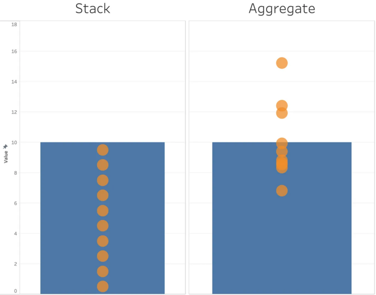
Michael Correll describes two kinds of bar charts in the world. The first kind shows counts where you can apply a visual metaphor of stacking things. The more you stack, the higher the bar gets. The second kind shows aggregates, such as mean and median.
Correll argues you should only use bar charts with stackable values. Otherwise, use something else.
This approach seems too extreme to me. Use bar charts where you see fit, which may or may not be to show aggregates. But the premise, which gets lost in bar chart minutiae, I can get behind, which is that bar charts are not always better and that you’re allowed to visualize complexity.


 Visualize This: The FlowingData Guide to Design, Visualization, and Statistics (2nd Edition)
