From Dan Goodspeed, the bar chart race is back. The length of the bars represents Covid-19 case rates per state, and color represents partisanship. The animation currently starts on June 1 and runs through October 13. It plays out how most of us probably assumed at some level or another.
Covid-19 cases and state partisanship
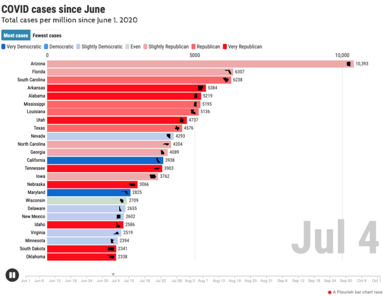
Chart Type Used

Second Edition
 Visualize This: The FlowingData Guide to Design, Visualization, and Statistics (2nd Edition)
 Visualize This: The FlowingData Guide to Design, Visualization, and Statistics (2nd Edition)
New tools, refined process.