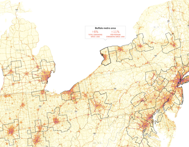
Using estimates from the Database of Road Transportation Emissions, Nadja Popovich and Denise Lu for The New York Times mapped auto emissions at high granularity. Popovich described their process on Storybench:
I want to make graphics that really resonate with people. If that is your goal as a visual journalist, something to think through is just how you can tie data back to a more human experience. To kind of go past the dataset as a dataset and reveal the humanity of it. I think one way that you can do that is by zooming into it in this way. You suddenly don’t just see, “Oh, this line of emissions has gone up.” We set out for a more personal view that says, “You know, you can actually see the roads that you might be driving on every day. That’s where the emissions are coming from.” It ties it back to a much more human experience and makes the data less abstract. Thinking a lot more through how to tie (the data) back to human-lived experiences is something that is really important and really we found resonates with readership.
 Visualize This: The FlowingData Guide to Design, Visualization, and Statistics (2nd Edition)