3-D-Printed Time Series Plates

Ever since my recent experience with 3-D printing, I’ve been itching for an excuse to print more. It’s a slow process that takes much longer than graphs rendered on a computer screen. But maybe that’s why it’s so satisfying.
In the end, I can hold the data, touch it, and look at it from all angles. The printing process also requires that I step away from my desk, which my wife has been gently suggesting I do more of lately.
Then this physical chart bubbled up in my feed:
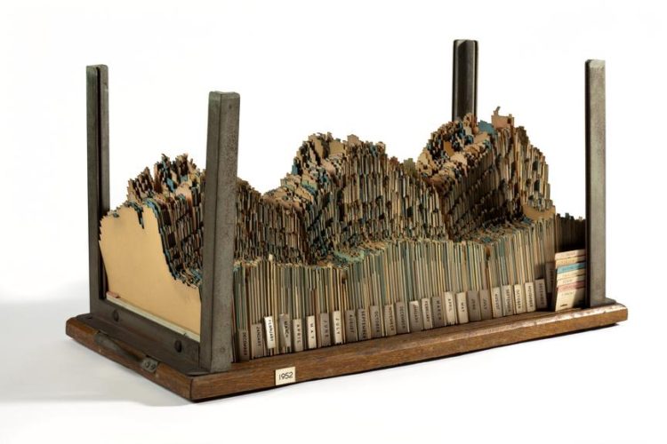
It was made in the 1950s. It shows energy usage in the United Kingdom from 1951 through 1954. Each card represents hourly usage in a day, so you can view the data as a whole, or you can pick out individual cards to look at segments of time more closely.
It’s awesome.
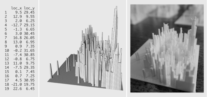
So in an effort to try my own, I pulled monthly unemployment data from the Bureau of Labor Statistics, consulted my own tutorial on prepping data in R for 3-D printing, and printed a plate for each year. This is what I got:
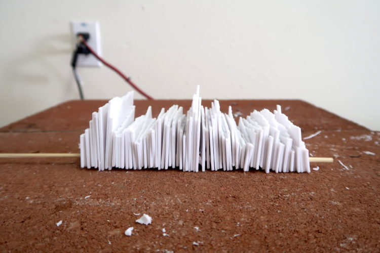
There are a lot of things to like. I can view from any angle:
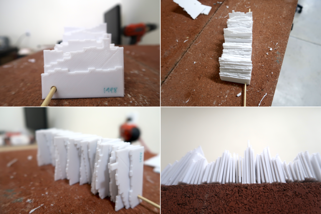
I can “zoom in” to any year by thumbing through the years like index cards:
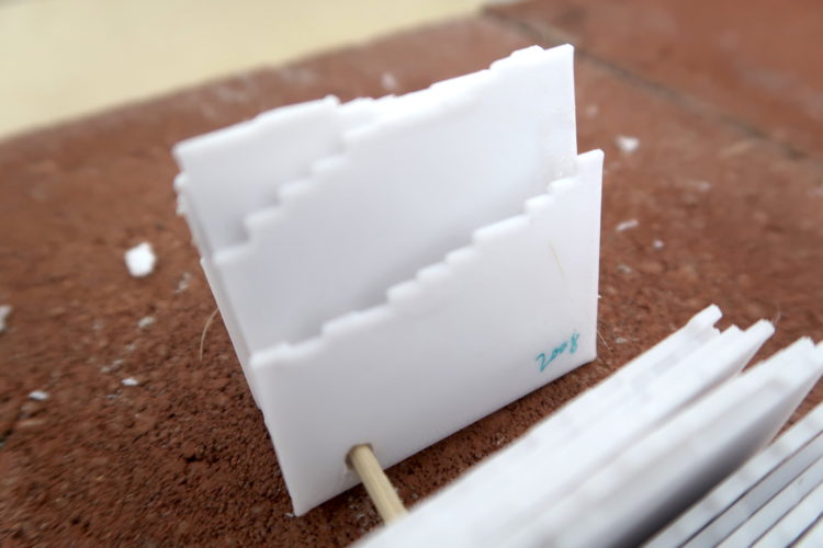
And I can lay it out however I want:
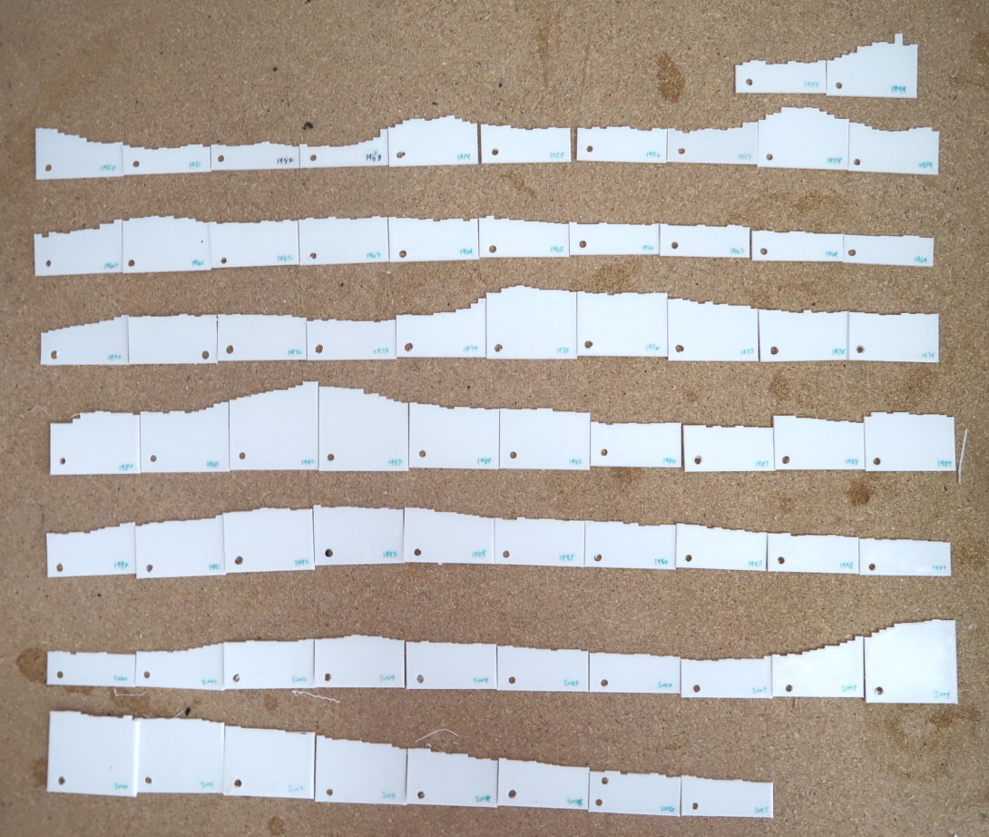
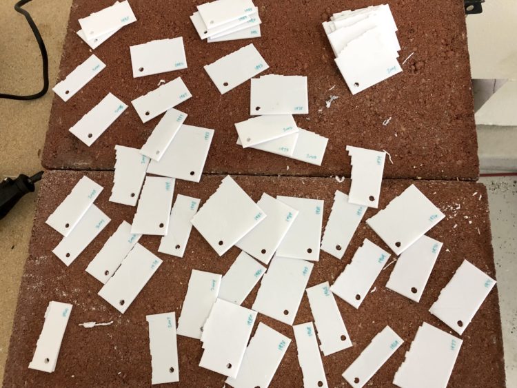
Of course, as we all know, with great power comes great responsibility. Throughout the process I’d be holding a stack of the plates, and because they were so slippery, I would drop all of them in a scattered mess. Organizing sure was fun. Luckily I labeled each one as they came out.
In retrospect, I would’ve used a dataset that was cyclical, so that I could see more of a pattern from stacking. It would look more like a rolling landscape than a spiky one.
I also would’ve encoded the holes or notches on the bottom to piece the plates together, but I realized the the need after printing, so I used a drill instead. My drilling wasn’t especially precise.
But that’s all part of the fun. As a slow work in progress, I learned more about the printing process. Next time: new dataset, color-coding, and a better mounting mechanism.
3-D Printing: How to Prepare the Data in R
I used a similar process to get the data in right format for printing.
Become a member. Support an independent site. Get extra visualization goodness.
See What You Get