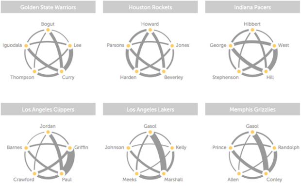
With player tracking installed in all of the NBA arenas, the sports analytics folks can essentially replay entire games through data and dissect the many facets of play. Andrew Bergmann looked at the passing averages between starters on each team.
The thickness of the gray lines on the accompanying chart represents the average number of passes per game between two players.
A very clear picture emerges on which teams distribute the ball more evenly between players, such as the Nets, Bulls and Cavaliers. On the flip side, Chris Paul and Blake Griffin dominate passing for the Clippers, and likewise for Kevin Love and Ricky Rubio of the Timberwolves.
These connections are non-directional, so it hides a little bit, but you still get a good sense of who the offense runs through based on the sum-width of connections from an individual. You can also easily see team ball distribution, which is the point of the graphic.
Next step: match ups. I bet that’s where the money’s at. We’ve seen a lot of analyses and graphics that show the activity of a single team, but ultimately, you want to know how your team plays against others in your division and playoff contenders. Ideal gameplay against subpar teams? Not so important.


 Visualize This: The FlowingData Guide to Design, Visualization, and Statistics (2nd Edition)
