Girls expected to live shorter lives in some counties?

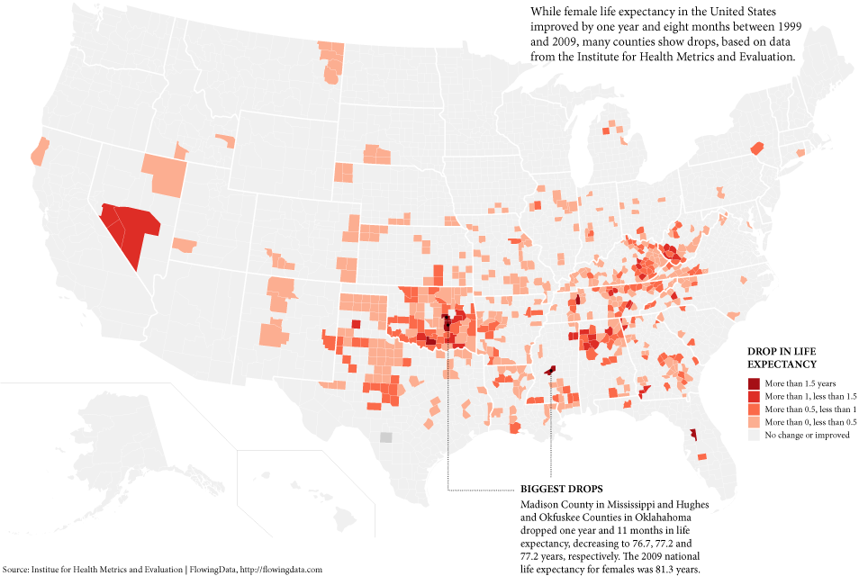
We’ve seen life expectancy at the country and state levels, but the Institute for Health Metrics and Evaluation, a health research center at the University of Washington, recently released life expectancy data at the county level. The press release focuses on the lower life expectancy of girls born in 2009 compared to those born ten years before. However, the main takeaway from the IHME map, while interactive, is that life expectancy has improved. I wanted to see where life expectancy dropped during the decade.
Update: Brett and Jørgen in the comments make good points on caveats of small-county life expectancy. Is this just statistical noise?
10 Comments
Become a member. Support an independent site. Get extra visualization goodness.
See What You Get


I think these data should be presented with the caveat that there will be a lot of statistical noise, especially in counties that are rural and thus lower-population. It reminds me of the now pseudo-famous differences in kidney cancer rates in rural areas (all the highest rates are in rural areas, but so are the lowest rates).
At first glance it looks like the counties on this map are mostly either a) rural or b) Southern (or both). I bet a map of the counties where life expectancy increased the most would also highlight rural counties because they have smaller populations and thus will see more random variation in these rates. There might actually be something going on with the Southern counties, but you can’t tell that from this map. And this map doesn’t give us any context re: how much life expectancy normally goes up and down in any given county in a ten year period — I imagine these aren’t normally perfectly smooth upward trends, right?
This is nice, but per the previous comment, you really should consider the “funnel effect”, well described by Ben Goldacre here: http://www.guardian.co.uk/commentisfree/2011/oct/28/bad-science-diy-data-analysis .
There are also studies showing that calculating life expectancy for small geographical units doesn’t make sense – a lot of difference is driven by child mortality, and if one newborn child dies (which some still do even in the best health-care areas in the world), it can drive a small region from the top to the bottom of the life expectancy statistics for that year.
Still, I am not saying that you don’t have a point in this particular case.
Good comments, guys. Updated.
Cool. To see (visually) whether this might be the case you could also make a map of (an equivalent number of) the most improved counties? I’d be curious to see if it was similarly rural or shows different geographic clustering. Another neat graph would be a histogram of count of counties in different bins of change in life expectancy — the funnel plot in the article Jorgen linked to is just what I was thinking of when I made my comment.
I understand the problems with the smaller populations, but the article at the link suggests there’s a difference between men and women: “In 661 counties, life expectancy stopped dead or went backwards for women since 1999. By comparison, life expectancy for men stopped or reversed in 166 counties. This troubling trend is occurring in 84% of Oklahoma counties, 58% of Tennessee counties, and 33% of Georgia counties.”
Off the top of my head I can’t think of a statistical noise explanation which would account for the difference?
Leaping off of a point made by Jørgen, is the teen pregnancy rate in those counties higher than the national average? Women under age 20 are at a slightly higher risk for birth injury and motherhood mortality, even in the U.S.
These counties are more poor than rural. Look at Nebraska, Iowa, So Dak, No Dak, Minnesota, Wisconsin. All of these states are easily as rural, with counties as depopulated as those shown. The plains have counties with far smaller populations than many of those illustrated.
There’s something going on here. This isn’t a random collection of small population counties.
Las Vegas has high rates of domestic violence. I don’t know if that’s a significant factor here, but the town’s clearly not the best place for women.
Oklahoma’s refusal to embrace the Health Care Act (“Obamacare”) included turning back $67 million in federal funds to set up the state “exchange” in compliance with the law. A Tulsa World article reported that implementing the Health Care Act in Oklahoma woud HALVE the numbers of Oklahomans without health care insurance (can’t have THAT!). With the Supreme Court ruling upholding the Health Care Act it remains to be seen what Oklahoma will do. Further foot-dragging will result in the feds setting up the exchange. We could be the “reddest state” with our legislature and Governor in the hands of the 1%. EVERYONE IN AMERICA MUST VOTE ON OR BEFORE TUESDAY, NOVEMBER 6th!
i know this was posted quite awhile ago…but i just want to throw in that the counties highlighted in oklahoma aren’t just poor or rural, they are also the ones with a large native american population. which is also a demographic with high number of suicides, deaths due to smoking and alcohol, diabetes, etc. the other thing that has happened in oklahoma in those years is a slow choking of planned parenthood and the ability to get an abortion. oklahoma also has the second least number of doctors per capita. they also have the highest rate of women in prison. i totally get that the low population can make the data all screwy… but there are some unusual things about the state that honestly could be accounting for how much it sticks out here.