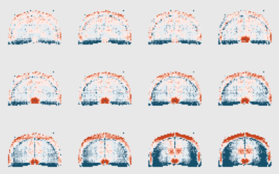
Ridgeline Chart with Color Gradients
Ridgeline charts are nice to look at, and that is enough reason to make them. Use a gradient fill for extra sauce.
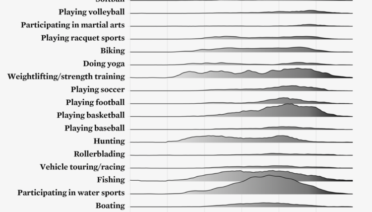
Ridgeline charts, sometimes but less often called frequency trails, show time series data with overlapping line or area charts. Because of the overlapping, you can see more vertically in less space than if you were to squish each category to a single band.
To access this full tutorial, you must be a member. (If you are already a member, log in here.)
Get instant access to this tutorial and hundreds more, plus courses, guides, and additional resources.
Membership
You will get unlimited access to step-by-step visualization courses and tutorials for insight and presentation — all while supporting an independent site. Files and data are included so that you can more easily apply what you learn in your own work.
Learn to make great charts that are beautiful and useful.
Members also receive a weekly newsletter, The Process. Keep up-to-date on visualization tools, the rules, and the guidelines and how they all work together in practice.
See samples of everything you gain access to:
About the Author
Nathan Yau is a statistician who works primarily with visualization. He earned his PhD in statistics from UCLA, is the author of two best-selling books — Data Points and Visualize This — and runs FlowingData. Introvert. Likes food. Likes beer.