NatureQuant processes and analyzes satellite imagery to quantify people’s access to nature. They call it a NatureScore. For the Washington Post, Harry Stevens mapped and charted the scores across the United States. At first glance, the map looks a lot like population density, but the better comparison is in how cities with similar population densities look next to each other.
Access to nature where you live
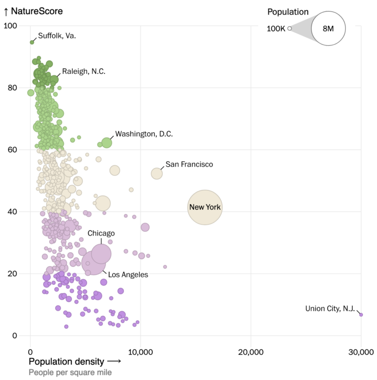
Chart Type Used

Second Edition
 Visualize This: The FlowingData Guide to Design, Visualization, and Statistics (2nd Edition)
 Visualize This: The FlowingData Guide to Design, Visualization, and Statistics (2nd Edition)
New tools, refined process.