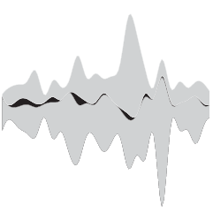
The Bloomberg medal tracker is fun to look at. I think the graphics desk was instructed to use as many new-ish chart types as they could without alienating readers: the streamgraph, force-directed clusters, an international map grid, line-based isotype, and plenty of bubbles. I’m into it.


