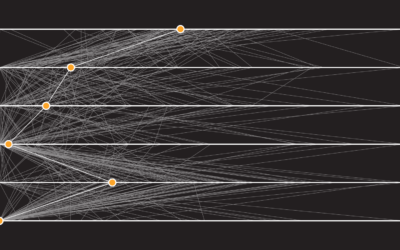
Jobs that Marry Together the Most
When it comes to marriage, the jobs that each person in a couple has can play a role in whether or not it works out. Maybe it’s similar schedules. Maybe it’s common ground and understanding between two people. Maybe jobs are an indicator for the types of people who match well together.
In the chart below, based on estimates from the American Community Survey, find out which jobs most often pair together among married couples.
Some pairings are simply volume. There are a lot of nurses and teachers, so they show up on top of the list often. However, click for a random occupation a few times or search for your own job, and you’ll see there are plenty of other matches in play.
Oftentimes, people marry someone in the same industry or with the same job.
For example, physicians often marry other physicians — about 1 in 5 out of every married physician. Anecdotally speaking, my wife is a physician, and usually on first introduction people will guess I am too. (I am not.) So experience seems to sync with what we’re seeing here.
Similar patterns appear for manicurists, lawyers, software developers, dentists, chiropractors, pharmacists, chefs, and plenty more. I’m kind of surprised by how much it comes up, even for the more specific occupation titles.
On the other hand, the highest pairing rate of 23 percent is between two “other agricultural workers”, which leaves 77 percent for others. So there’s lots of combinations.
Notes
- For a relative comparison, which takes into account how many people work each job, see this bubble chart.
- The data comes from the American Community Survey 2018 and 2019. Every now and then occupation classifications change (currently 529), and these were two most recent comparable years. I downloaded the microdata via IPUMS.
- Susie Nelson compared occupation matchups for San Francisco, which got me thinking about this dataset again.
- I analyzed and prepared the data in R. I made the chart with D3.js.
Chart Type Used

Become a member. Support an independent site. Get extra visualization goodness.
See What You Get