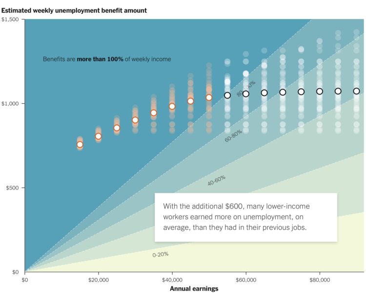
A $600 per week benefit expires for the unemployed at the end of July. Congress is still deciding what to do after. For The New York Times, Ella Koeze highlights the percentage of usual income the unemployed will receive as a function of annual earnings and weekly benefit amount if the benefit goes away.
Each dot represents a state. The percentage ranges in the background provide a point of reference for where each income group and state falls. The scrollytelling format starts with individual points and then tours through the shifts.
An aside: I might just be imagining things, but I feel like there’s been more scrollytelling lately. Is this a function of doomscrolling on our phones? Also, whenever a chart anchors in the background and a text frame scrolls over, I think of Snow Fall from 2012.


