How Much Commuting is Too Much?
One person’s long commute is another’s dream. Another person’s normal might be someone else’s nightmare. How much traveling you’re willing to take seems to depend a lot on where you live. Here’s a map.
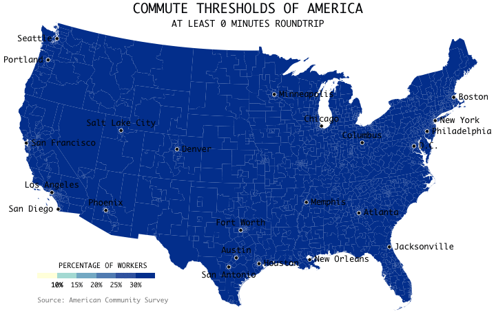
The above shows the commute thresholds for the conterminous United States, based on data from the 2017 5-year American Community Survey. The percentages are cumulative. It starts with the percentage of workers with at least a 0-minute commute roundtrip (i.e. everyone). Then it shows the percentages with at least a 10-minute commute, 20-minute, 30-minute, etc.
Three hours. That’s the cutoff.
I grew up in a city where my dad’s 15-minute commute seemed like a long time. My mom only had to drive for 7 minutes to get to work. I rode my bike to school. On the other hand, my father-in-law commuted an hour and a half to get to work. He would leave the house at four in the morning to beat traffic and then sleep in the parking lot until his shift started.
It’s all (painfully) relative.
Notes
- The data comes from the 2013-2017 5-year American Community Survey, which is administered by the Census Bureau. I downloaded the data via IPUMS. Geography is at the PUMA (Public Use Microdata Area) level, which is the smallest geography provided in the microdata for privacy reasons.
- I analyzed the data and made the animated map in R.
- Relevant tutorial: How to Make Animated Visualization GIFs with ImageMagick
Become a member. Support an independent site. Get extra visualization goodness.
See What You Get