Peak Non-Creepy Dating Pool

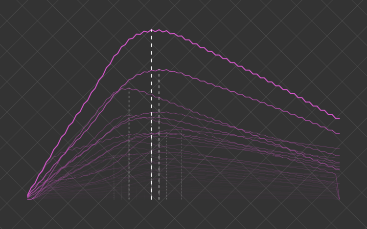
The percentage of people who are single declines with age. However, based on the “half-your-age-plus-seven” rule, the range of people you can date expands. Combine that with population counts and demographics, and you can find when your non-creepy dating pool peaks.

Become a member. Support an independent site. Make great charts.

See What You Get

Learn to Visualize Data See All →

How to Make a Dynamic Multi-population Pyramid in Excel

Create better population pyramids that allow for improved comparisons between sexes and populations.

How to Make Dot Density Maps in R

Choropleth maps are useful to show values for areas on a map, but they can be limited. In contrast, dot density maps are sometimes better for showing distributions within regions.

How I Made That: Animated Difference Charts in R

A combination of a bivariate area chart, animation, and a population pyramid, with a sprinkling of detail and annotation.

How to Make Animated (GIF) Heatmaps in R

Using color as the visual encoding, show changes over time in two dimensions.

Favorites

Data, R, and a 3-D Printer

We almost always look at data through a screen. It’s quick and good for exploration. So is there value in making data physical? I played around with a 3-D printer to find out.

Counting Happiness and Where it Comes From

Researchers asked 10,000 participants to list ten things that recently made them happy. I counted and connected the dots.

10 Best Data Visualization Projects of 2015

These are my picks for the best of 2015. As usual, they could easily appear in a different order on a different day, and there are projects not on the list that were also excellent.

Interactive: When Do Americans Leave For Work?

We don’t all start our work days at the same time, despite what morning rush hour might have you think.