10 Best Data Visualization Projects of 2017
This year was a weird one. I don’t know. It was weird. It seemed like every day there was something to be mad or sad about, and it all happened at such a fast pace.
This carried over to the news and the type of visualization work we saw this year. Graphics from the major media orgs were less big and more deadline-heavy. Everything had to work on mobile, which carries with it screen limitations and depth limitations.
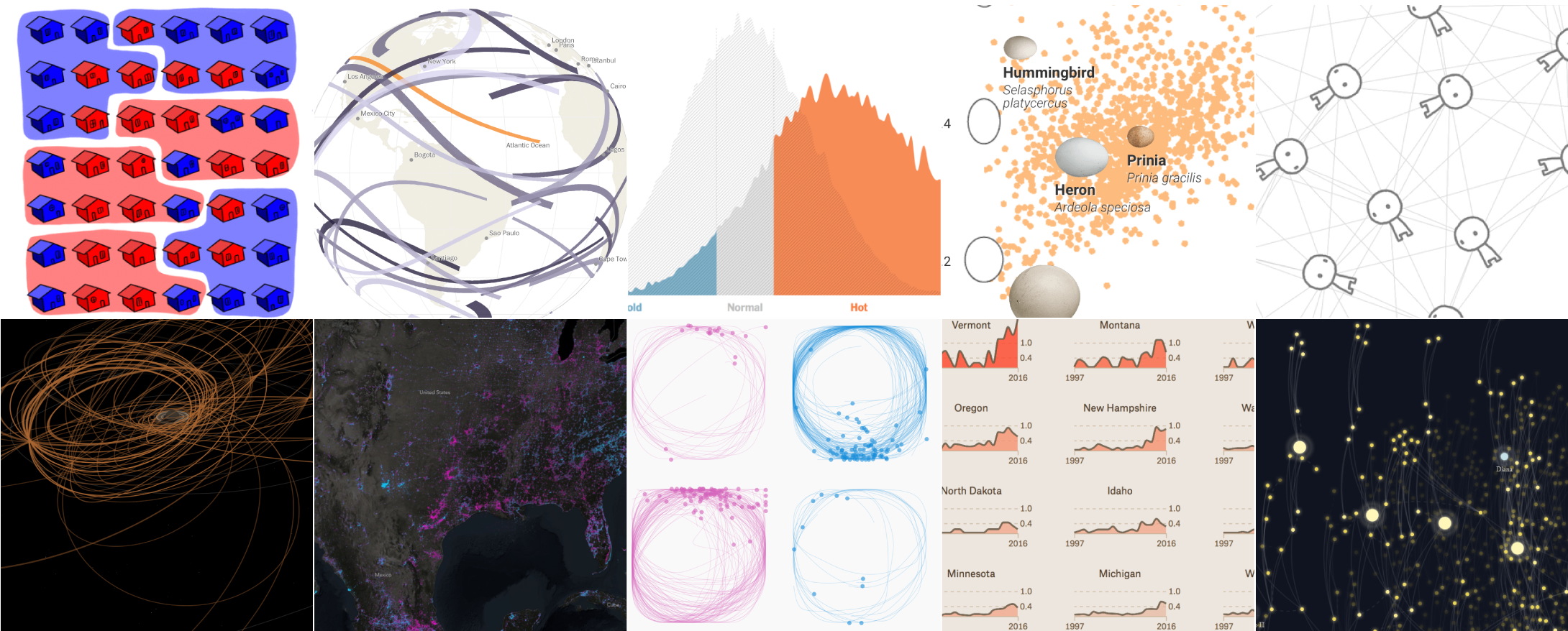
But hey, we made it. Here are my ten favorite data visualization projects of the year in no particular order. Looking over them now, I definitely favored slow consumption over fast and breaking.
Changing the Math on Gerrymandering
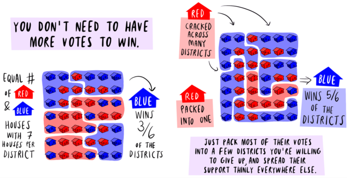
Olivia Walch explained gerrymandering in comic form to make it more than just that chapter you had to read in high school government class. I think there’s something to this combination of data and comics. [See the Project / On FlowingData]
Cassini’s Grand Tour
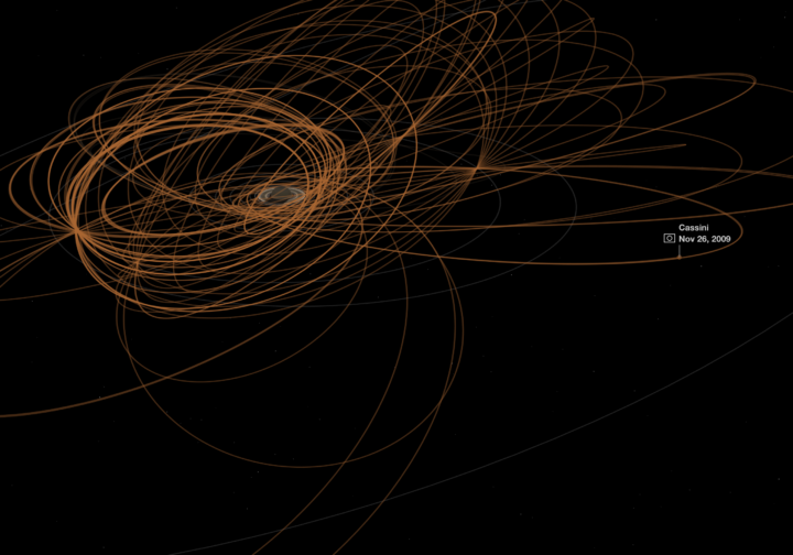
The Cassini satellite orbiting Saturn was ready for its planned crash into the atmosphere. Nadia Drake and Brian T. Jacobs for National Geographic detailed the satellite’s 13 years of travel and what it found. I went from having no clue to what Cassini was to counting the days until the satellite’s end. [See the Project / On FlowingData]
How do you draw a circle? We analyzed 100,000 drawings to show how culture shapes our instincts
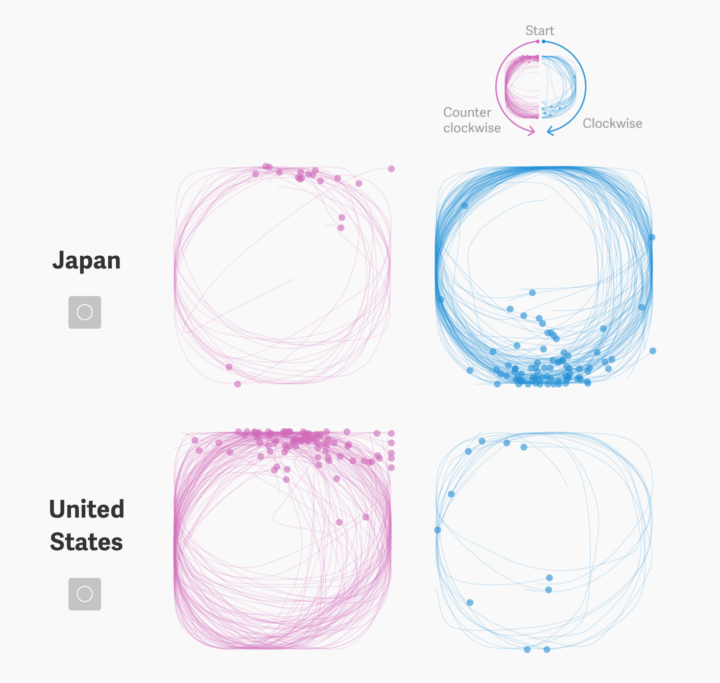
The Google Quick, Draw! dataset allowed for a number of interesting projects this year. Thu-Huong Ha and Nikhil Sonnad focused specifically on how people draw circles and how it varies across demographics. I like the link they made with handwriting and culture. See also Mauro Martino’s Forma Fluens. [See the Project / On FlowingData]
Lights On & Lights Out
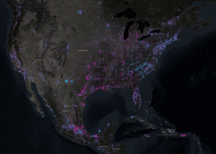
John Nelson compared the 2012 Earth at Night satellite image to the 2016 version to estimate new lights and faded out lights in the world. John also described his process. [See the Project / On FlowingData]
The Evolution of Trust
Nicky Case, explainer of systems in the real world, delved into game theory and the evolution of trust. It’s a game and you learn something. [See the Project / On FlowingData]
Cracking the Mystery of the Egg Shape
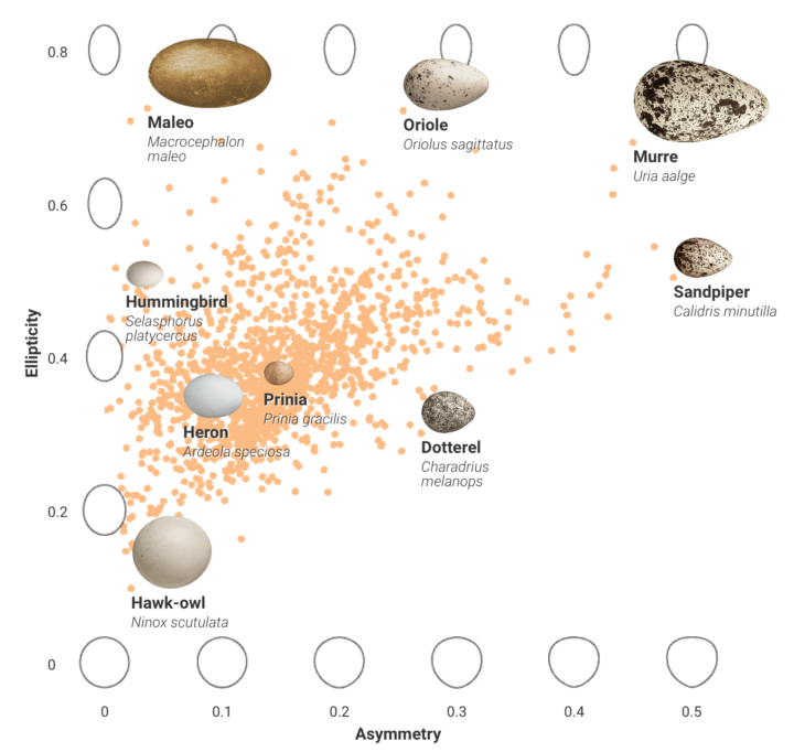
Different types of birds lay different shaped eggs, but scientists didn’t know why until recently. Sarah Crespi and Jia You, for Science, used a combination of video, data graphics, and illustrations to describe a topic you thought you didn’t care about. [See the Project / On FlowingData]
Data Sketches
Maybe everyone should work with the buddy system. Data Sketches is a collaboration between Nadieh Bremer and Shirley Wu. Each month they chose a topic and each person created a usually non-traditional, interactive graphic. The project seemed to trail off midway, but hopefully the gaps get filled. [See the Project / On FlowingData]
The Pudding
From the folks behind Polygraph, the one-year-old “journal for visual essays” is an ambitious project to help others understand complex topics through data and charts. It’s interesting to me from a visualization standpoint, an editing one, and as a business model. Worth reading their goals for next year, if you’re into that last bit. [See the Project]
Here’s every total solar eclipse happening in your lifetime. Is this year your best chance?
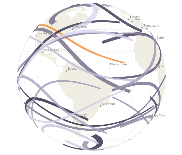
There were a lot of graphics for the total solar eclipse but this one by Denise Lu for The Washington Post was my favorite. It starts with you and then goes into the details. [See the Project / On FlowingData]
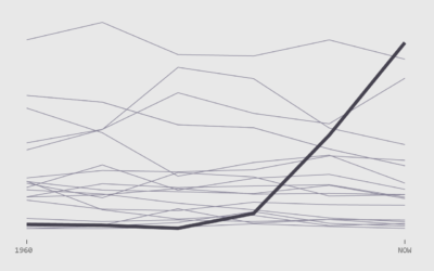
It’s Not Your Imagination. Summers Are Getting Hotter.
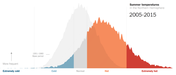
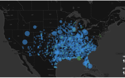
Nadja Popovich and Adam Pearce used a histogram to visualize summer temperatures, which is not easy to do for a wide audience. I think they pull it off with a combination of animation and annotation. Explaining statistical diagrams really is a New York Times forte. See also you-draw-the-line, the tax scatterplot, and the cost of Hurricane Harvey bubble plot. [See the Project / On FlowingData]
Honorable Mention
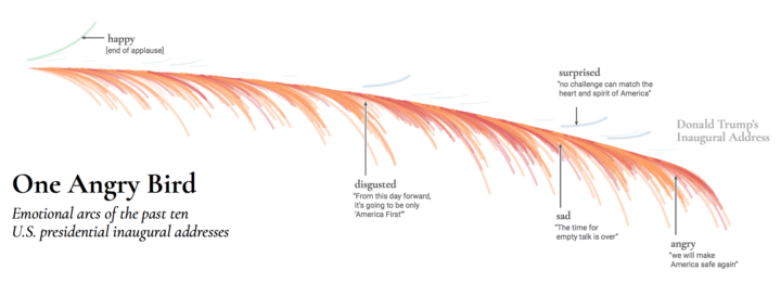
One Angry Bird
I tried to limit what I put up here on FlowingData covering this topic. I think you get enough of it elsewhere. But this piece by Periscopic uses a feather metaphor to represent emotions during inaugural addresses, and it’s a pretty good representation of 2017. [See the Project / On FlowingData]
Honorable Mention
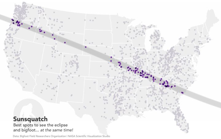
Sunsquatch
This map by Joshua Stevens showed the overlap between sasquatch sightings and the total eclipse path. Joshua visualizes data at NASA, so you know it’s legit. For a moment, social media was fun again. [See the Project / On FlowingData]
Become a member. Support an independent site. Get extra visualization goodness.
See What You Get
