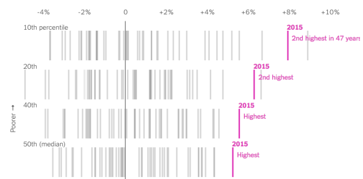
We know that income increased by a lot in 2015, but for who? If it’s just the rich getting richer, then the rise doesn’t mean much for a lot of people, but as Quoctrung Bui for the Upshot points out, this was not the case.
Real median incomes rose 5.2 percent in 2015 — phenomenal growth by economic standards. And 3.5 million people moved out of poverty. But more important, 2015 was encouraging to economists because of where income growth was concentrated: the poor and middle class.
I’m not 100% sure what to call this chart type, but the going term seems to be barcode chart. Each vertical line represents a year, and each row represents an income bracket. Mouse over a bar and you see the change in income for all brackets during the corresponding year.


